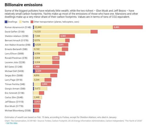
Charts like these – showing the immense carbon footprints of billionaires – should make us seriously question any exhortation on what "we" must do to address #ClimateChange (I'm guilty of using this phrasing too). Always ask: who is the "we"?
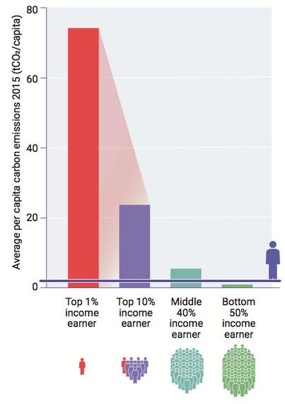
Talking of which, I have lots of charts like this showing the *per capita* carbon footprint of the top 1%, 10% of global wealth. But does anyone have similar charts comparing total emissions. I saw one recently that suggested the super-rich contribute about 1/3 of all global emissions. But now I can't find it...
@steve Well, 1% of people are in the top 1%. So if you're doing trials you multiply each "top X%" number by X, then normalize then all so their sum is 100%.