
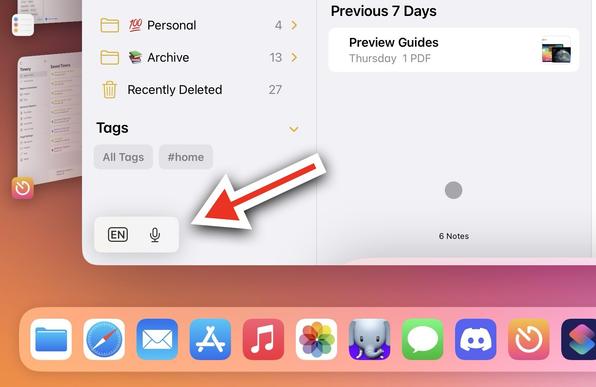
My personal crusade against the "minimized keyboard accessory" control for iPadOS continues.
Today's example: I wanted to create a new folder in the Notes app, but I couldn't because that thing was covering the button. 😡
( friends: FB12451439)
My personal crusade against the "minimized keyboard accessory" control for iPadOS continues.
Today's example: I wanted to create a new folder in the Notes app, but I couldn't because that thing was covering the button. 😡
( friends: FB12451439)
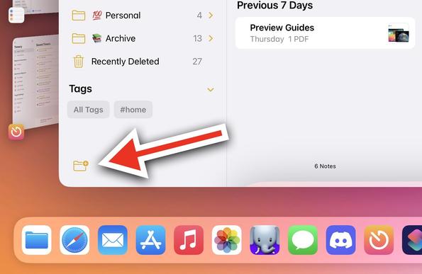
"Just move it to the other side of the screen"
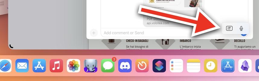
I did. And guess what: the minimized control just covered the Send button for the Messages composer.
This UI element needs to go. It's a bad idea, badly realized for the past year. Surely Apple can come up with something better than this.
@viticci Oh yeah... I don't really understand what was wrong with previous „touchbar-like" full width keyboard bar? yeah, it took a little bit of vertical space, but it was SOLID.
If they could improve keyboards on iPads, I would also enlarge small "floating" keyboard - why is it so small while we have so much space on the iPad? It could use „iPhone Plus" layout… 🤔