I have to repeat myself. Why isn't this on the headline of all newspapers?
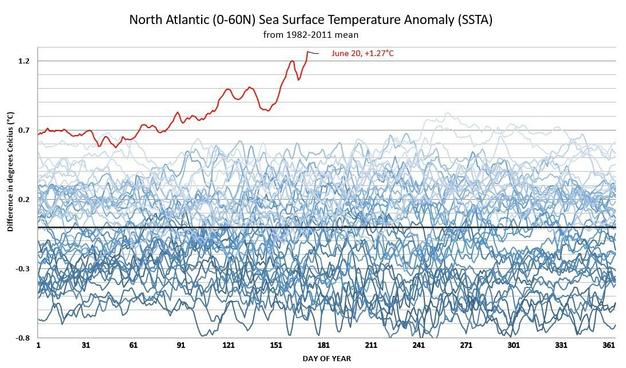
where is that pretty blue-lined graph coming from? I found this one
https://climatereanalyzer.org/clim/sst_daily/ but that shows the base data (which is useful too), not flattened relative to the day-of-year mean (which makes it easier to see the magnitude of the anomaly)
ah looks like it might have come from the legendary Peter Gleick 👍
https://fediscience.org/@petergleick/110583149984527655

Attached: 4 images · Content warning: Angry rant from climate science communicator.
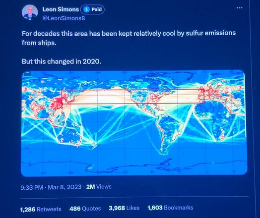
Sabine covers the anomaly here at 14m10s or so https://youtu.be/65it0Slapwk — one idea for why this is happening now is that recently, sulfur emissions from big ships were outlawed, and sulfur reflects sunlight