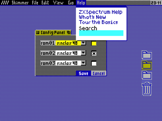
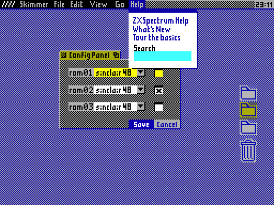
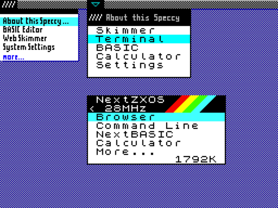
I made a quick proportional font (to be perfected later) for the menu texts. I personally like the small type better, but I reckon that others struggle with small type, and for many people it's not a matter of aesthetical preference, but a need of accessibility, so it makes sense that we add the option of a more readable proportional font for that. Thanks @TomF for your help.

#ZXGUI #ZXSpectrum #Spectrum #Speccy #GUI #retrocomputing

@haitchfive Hmmm... interesting. It's clearer, but not necessary more readable for some reason! Eyes are a strange thing.
@TomF
Should I keep the old original Sinclair mono font as an option?
@haitchfive If you do, I would at least make it proportional by removing the space. I've done this myself and it's about 40% more letters for the same "look and feel"

@TomF

That's the same approach used in the FUSE menus. I'll do that then, added to the TO-DO list.