 Carlo Grosoli
I'm quite a FrontEndDev rookie.
So if anyone wants to give constructive criticism, I'll be happy to enrich my knowledge.
https://codepen.io/carlogr/pen/YzJgbOa?editors=1100
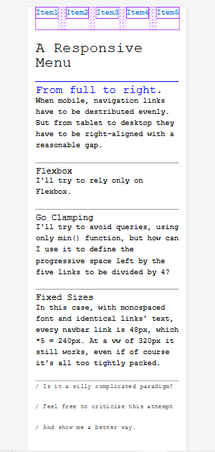
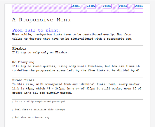
I tried to make a navbar menu with flexbox and min() function for gaps, without using justify-content.
The menu must take the full 90vw on mobile, and keep itself right-aligned with a 2.5em gap from tablet to desktop, avoiding queries, hamburger/kebab hidden menus.
Feel free to demolish it. I'm learning.