no one has ever surpassed the animated netscape logo's ability to make the internet feel majestic and awe inspiring
@listeninggarden It was certainly better than v1.0’s purple N, which pulsed disturbingly!
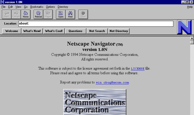
@jwz @listeninggarden Thanks for the link - I remember that when we got to beta test Netscape 1.0 back at uni (on RS/6000s running AIX 3.2.5!), it was definitely faster and swisher than Mosaic, but the logo was just ugly.
And gosh, yes - the compass! I haven’t seen that in decades.
@gmh @listeninggarden The 1.0 logo was responsible for all of those animated browser "loading" icons being known as "throbbers" and.. well, you can see why..