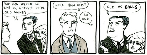
I've been mulling over why Kate Beaton's work, and especially her character art floors me so much, even though there are now lots of artists with similar styles. Here's what I think it is: what's astonishing in her work is that it somehow sneaks a massive amount of subtlety into characters who are ludicrous.

Consider this classic:

There are two tricks I really like here. One, notice Gatsby in the middle panel is made a little subdued. In comics there's always a temptation to go for big expressions. But, she reserves that. Then in the last panel almost every goddamned stroke of the pen is UP TO SOMETHING. Even the noses are slightly turned from the first panel to convey a feeling. Look how the chin reshapes and the hair flattens itself aggressively.
The level of artistry has drastically improved since the old webcomics days, but I'm not sure I've seen anyone excel so thoroughly at this combination. What's amazing is that ability can take a pretty straightforward joke and really elevate it. It's like the visual equivalent of James Earl Jones' voice - everything is at least pretty good, and the great stuff is unmatchable.
@ZachWeinersmith I also like the lean-in towards Gatsby in the first panel. It's very aggressive and also dismissive at the same time (bery 'let me tell you'). And the axial cut on the 3rd panel is *chef kiss*