Last update: https://crab.garden/@alexm/110113801811041873

Posting this one as individual toots instead, since the last update was unreadable.

---

Not all that much happened in the main branch this time, but we have 2 additions related to list rows, both originally by @brainblasted.

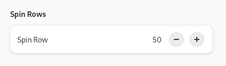
1. There's now AdwSpinRow - it's like AdwEntryRow but with GtkSpinButton.

It has basically identical API to GtkSpinButton - one difference is it omits the value-changed signal - it's 100% identical to notify::value and people can just use that instead.

And it looks a bit nicer than regular spin buttons.

Docs: https://gnome.pages.gitlab.gnome.org/libadwaita/doc/main/class.SpinRow.html

Alex :blobcatverified: (@[email protected])

Attached: 1 image ยท Content warning: libadwaita updates, long

Hometown

One thing to note: the original mockups positioned the number in between the - and the + buttons as follows: "- 50 +". That part was not implemented, not only because it would require poking into GtkSpinButton internals or rewriting it, but also because that really doesn't work when the displayed number has less digits than the maximum amount it's allowed to have. This means that in practice it won't look tidy like on mockups, but more like: "- 50 +".

And when you have multiple spin rows in a single list, chances are that the - buttons will be positioned differently on each row. The spring animations demo page is a good example of that happening.

On this screenshot I've right-aligned the spinbuttons (they normally extend all the way to the row title) and added a background to show this.

The - buttons would be aligned same as the backgrounds here - not good. So, they had to go.

And if you center align the numbers as well to have even spacing - well, the numbers would be misaligned too.

2. There's now a .property style class that can be added to AdwActionRow or AdwExpanderRow. It basically inverts the row's title and subtitle.

It's just a style class instead of a widget because having a full widget for this would be overkill, as otherwise it would be identical to action rows.

This standardizes an existing pattern - rows like this have already been used in Nautilus' and Loupe's properties. This should also be useful for apps like Contacts.

Docs: https://gnome.pages.gitlab.gnome.org/libadwaita/doc/main/style-classes.html#property-rows

Adw: Style Classes

Reference for Adw-1: Style Classes

Now what hasn't landed yet. I've made a bit more progress on adaptive states.

For one, everything has been renamed. Last week I posted a poll of whether it should be Breakpoint or BreakPoint, and so:

- AdwAdaptiveState is now AdwBreakpoint
- AdwAdaptiveCondition -> AdwBreakpointCondition
- AdwAdaptiveBin -> AdwBreakpointBin
- :current-state -> :current-breakpoint
- add_adaptive_state() -> add_breakpoint()

This should be clearer - that's what most people call this on other platforms, even when they aren't called that in the API.

Next, breakpoint conditions have been completely reworked.

Previously, there were 2 functions for creating them:

adw_adaptive_state_new()
adw_adaptive_state_new_multi()

The first one accepted type (min/max width/height/aspect ratio) and value. The second one accepted type (all/any) and N other conditions.

Multi conditions have been simplified to only support two conditions at a time - if people want more, they can nest them but this is almost never be needed in practice anyway. And to avoid an extra enum, the constructors are now just:

adw_breakpoint_condition_new_and()
adw_breakpoint_condition_new_or()

Other conditions have been split into 2 kinds, mirroring CSS: length and ratio conditions.

Length conditions can be min/max width/height, and they have a floating point value and a unit. That part is new, we previously only supported pixels in here. Currently units can be pixels (px), points (pt) or css root element/rem unit.

The important difference from pixels is that these units change with text scale factor and font size respectively, so the thresholds can vary to accommodate Large Text better.

One thing I think we still need is a unit like Android's sp (scaled point) which would be just pixels * text scale factor. Then it can be used same as pixels, but will automatically work for Large Text, without the need to be familiar with how much exactly is 1pt/1rem compared to 1px.

Meanwhile, ratio conditions can currently be min/max aspect ratio and accept 2 integers.

This split avoids having to have a useless unit parameter for aspect ratio conditions, and also allows to express aspect ratios as 4/3 instead of having to write that manually. Especially in UI files where that's impossible and you previously had to write 1.333333 yourself.

The next addition is a parse() function that allows to create conditions from a string. The strings can look as follows:

Length:

- max-width: 400px

(or pt or rem or if the unit is not specified, it assumes px)

Ratio:

- max-aspect-ratio: 4/3

(/1 can be omitted)

Logic:

- max-width: 400px and max-aspect-ratio: 4/3
- max-width: 400px or max-aspect-ratio: 4/3
- max-width: 400px or (max-width: 200px and max-aspect-ratio: 4/3)

And so on. If parentheses are omitted, the first operation always takes priority.

So basically the format is inspired by CSS media queries.

While I don't like having a parser for this, it was quite cumbersome to use programmatically, so I think it's worth it overall.

to_string() was also modified to serialize into the same format, if anything so I can use it to test the parser. :)

And finally, UI files. While it was already possible to specify conditions there, it was getting clunky with units, so instead it now uses a single <condition> tag and feeds the text inside into parse().

So instead of:

<condition type="max-width">400</condition>

you now write:

<condition>max-width: 400px</condition>

And instead of:

<condition type="all">
<condition type="max-aspect-ratio">1.33</condition>
<condition type="max-width">450</condition>
</condition>

you now write:

<condition>max-width: 450px and max-aspect-ratio: 4/3</condition>

The last part made an earlier GTK fix unnecessary, but oh well.

Speaking of GTK, last time I mentioned how ellipsizing buttons would fail in a header bar: when shrinking a window, they would get ellipsized first, before the window title.

There is now a way to prevent that: https://docs.gtk.org/gtk4/property.CenterLayout.shrink-center-last.html and https://docs.gtk.org/gtk4/property.CenterBox.shrink-center-last.html

Unfortunately, GTK people didn't want to actually enable it for GtkHeaderBar and GtkActionBar, so this behavior will be different between GtkHeaderBar and AdwHeaderBar. Oh well.

And I'm still waiting for GtkButton:can-shrink to land.

Gtk.CenterLayout:shrink-center-last

Reference for property Gtk.CenterLayout:shrink-center-last

Meanwhile I implemented a similar property for AdwButtonContent, and once the GTK one is available I'll add the same thing for AdwSplitButton.

So, the only missing things for breakpoints are now that + docs + need to decide on units.

And that's it for now.

@alexm typo: CenterLayou instead of CenterLayout
@nahuel whoops, fixed, thanks!