[thread] Do you ever wonder how new seasonal flu vaccines get picked? Our new paper in Frontiers in Bioinformatics (
https://doi.org/10.3389/fbinf.2023.1069487), led by Jover Lee and James Hadfield, shows how genetic data and lab experiments have been used to make those decisions in the past and how our new interactive visualization tool, Nextstrain’s measurements panel, can simplify that process by connecting genetic and experimental data in a single place.


Joint visualization of seasonal influenza serology and phylogeny to inform vaccine composition
Seasonal influenza vaccines must be updated regularly to account for mutations that allow influenza viruses to escape our existing immunity. A successful vaccine should represent the genetic diversity of recently circulating viruses and induce antibodies that effectively prevent infection by those recent viruses. Thus, linking the genetic composition of circulating viruses and the serological experimental results measuring antibody efficacy is crucial to the vaccine design decision. Historically, genetic and serological data have been presented separately in the form of static visualizations of phylogenetic trees and tabular serological results to identify vaccine candidates. To simplify this decision-making process, we have created an interactive tool for visualizing serological data that has been integrated into Nextstrain’s real-time phylogenetic visualization framework, Auspice. We show how the combined interactive visualizations may be used by decision makers to explore the relationships between complex data sets for both prospective vaccine virus selection and retrospectively exploring the performance of vaccine viruses.
Each time you get sick with or vaccinated against the flu, your immune system sees the bits on the surface of the flu virus (especially those in blue below) and makes antibodies (the Y shape below) that can attach to the virus surface. The next time your immune system sees a similar flu virus, it makes more copies of those antibodies. The antibodies attach to the new virus and keep it from infecting you. As a result, you don’t get as sick as you would without that immune memory.
When you get sick with the flu, the virus makes copies of itself and the instructions to make more like it (the “genome”, horizontal lines below). As it copies its genome, the virus makes mistakes. Most mistakes lead to viruses that don’t work, but some (in red below) change the shape of the virus’s surface, preventing your antibodies from attaching to the new virus. This is why you can get sick with the flu many times in your life and why the flu vaccine has to be updated almost every year.
Doctors can collect flu viruses from sick patients and scientists can work out the genome for each virus. Each genome can be represented as a string of four letters (A, C, G, T). Each row below is the start of a different genome. Scientists can compare genomes from different viruses to find changes that only appear in a few viruses or that are shared across viruses. Viruses with enough of the same changes may be related to each other through a common ancestor.
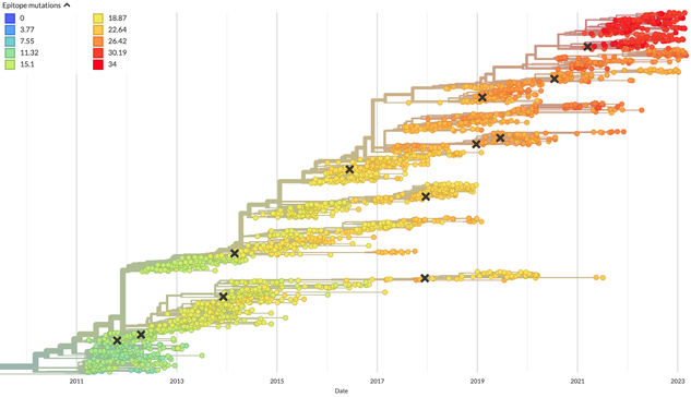
Scientists use these changes to understand how viruses are related to each other and make a kind of virus family tree. In the tree below, each circle is a different flu virus collected in the last 12 years and each X is a flu vaccine virus. These trees show groups of viruses with changes to their genomes that *might* allow them to escape our immune systems (count of changes in color). The flu virus we pick for the vaccine ideally represents recent viruses with changes that escape our immunity.
Unfortunately, we don’t know which changes to virus genomes actually change the shape of the virus surface enough to need a new vaccine. We need lab experiments to measure the effects of genome changes on the virus surface. These experiments mix 1) antibodies that detect a specific virus (like the current vaccine), 2) red blood cells, and 3) a test virus. If antibodies attach to the virus, the virus can't attach to the cells, forming a pattern that can be seen by eye (
https://www.cdc.gov/flu/about/professionals/antigenic.htm).
Antigenic Characterization | CDC
How CDC uses antigenic characterization as part of global flu surveillance and to select viruses for use in the seasonal flu vaccine.
Below, the small red dots show when antibodies against Virus A block each virus from attaching to cells. A small amount of antibodies against Virus A blocks Virus A, but Virus B and C require more antibodies against A to block them. The more antibodies against Virus A needed to block a virus, the more the shapes of Virus A and the other viruses differ. We can convert these amounts of antibodies into distances between pairs of viruses to measure how different they appear to an immune system.
For a long time, scientists compared virus measurements in tables like this (
https://www.pnas.org/doi/full/10.1073/pnas.1525578113). Each cell is one experiment where the column is the virus whose antibodies were used (the current vaccine virus or potential future vaccine viruses), the row is the virus that was tested with the antibodies, and the number is how diluted the antibodies were when they blocked the virus from attaching to the red blood cells (“1280” is 1 antibody in 1280 parts liquid).
Although these tables say something about how well antibodies against the flu vaccine virus might protect us against new viruses, it is hard to see patterns across all viruses in tables of numbers and these numbers don’t show which changes in virus genomes might allow those viruses to escape our immune system. To pick a new vaccine virus, scientists need to know which viruses are most common now and also escape our immunity.
To this end,
@trvrb and
@richardneher created nextflu (
https://doi.org/10.1093/bioinformatics/btv381), a tool that draws the tree of how viruses are related and colors the tree by the distances between viruses that come from experimental measurements like those in the table shown above. Each “gear” below is a potential vaccine virus. Clicking a gear shows how different the surface of that virus appears to an immune system compared to other recent viruses (greater distance shows a greater difference).

nextflu: real-time tracking of seasonal influenza virus evolution in humans
Abstract. Summary: Seasonal influenza viruses evolve rapidly, allowing them to evade immunity in their human hosts and reinfect previously infected individuals.
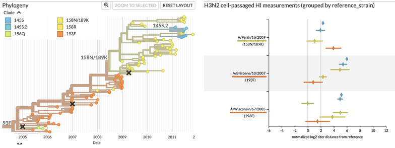
From dozens of choices, scientists have to pick a single vaccine virus that best represents the viruses that are circulating in the world now. The tree view shows what viruses are circulating now, but it only shows the experimental measurements for one potential vaccine virus at a time. Trevor and Richard complemented their tree view with a “heatmap” that shows the average distances (text and color) between recent groups of viruses (columns) and potential vaccine viruses (rows).
The heatmap allows scientists to quickly see which potential vaccine viruses are the closest to the most groups of recent viruses. In the view above, the potential vaccine virus, A/Perth/16/2009, is clearly closer to two of the major recent virus groups than the other viruses. But, this view doesn’t tell us how common those virus groups are, how many experimental measurements support the average value, and how much uncertainty we have about those averages. We need a better view!
This is where the Nextstrain measurements panel comes in! The panel (right) redraws the same information shown in the heatmaps with average measurements (diamonds) for each potential vaccine viruses (rows) against recent virus groups (color). It also shows uncertainty of measurements (error bars), important distance cut offs (vertical lines), and the tree of recent viruses colored by group. Better potential vaccine viruses have diamonds closer to the vertical line at 0 for recent virus groups.
Users can toggle the display of averages and uncertainty to show individual measurements instead. This view shows how many measurements exist for each group of viruses, whether there are any patterns in those measurements that were hidden by the average values, and provides details about specific measurements when users hover over a point in the panel.
Most importantly, the measurements panel is an interactive visualization that is connected to the tree. When users zoom into the tree or color the tree by information about individual viruses, the measurements panel updates to show only those test viruses that are shown in the tree and color measurements for test viruses by the colors in the tree.
This new tool allows scientists who make decisions about the flu vaccine to visualize their experimental and genetic data more effectively. However, anyone who wants to visualize their experimental data in the context of genetic data could benefit from using the measurements panel. Try out a demo of the tool (
https://nextstrain.org/community/blab/measurements-panel/flu/seasonal/h3n2/ha?p=grid), check out an example workflow that we used for these examples (
https://github.com/blab/measurements-panel), and let us know what you think (
https://discussion.nextstrain.org/).