Having a lot of fun working on some more design today.

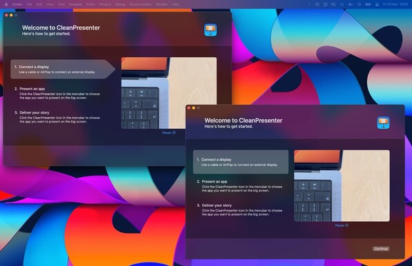
Today the put together the getting started screen; demonstrating the steps to start a presentation in both text and video. We highlight the step currently shown in the video.

Should we go for the square or arrow highlight? 🤔

#buildinpublic #swiftui #uidesign

@mathijskadijk Unless there is a design harmony with visual elements in the app elsewhere, the square will be more versatile for smaller windows/screens/more content. The angle on the arrow wastes space for it’s decorative flare that doesn’t bring much more to the table than the alternative.
@phy Good points! Thanks. :)