@matuzo If you wanted to style a link like a button, say a "View" link that takes you elsewhere, this could be a decent approach, no? Whereas actual buttons (the kind that trigger an action _on the page_, or submit a form) might not need these classes (or maybe in your app they do, to keep things consistent). Like "View," "Edit," "Delete" "buttons" that you may want to style similarly (and where Edit and Delete trigger a POST/PATCH/PUT/DELETE request rather than a GET request)?
 Manuel Matuzović
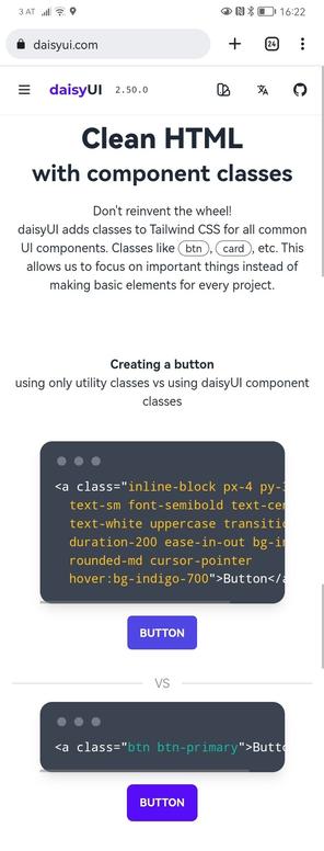
 Jan Boddez
 ➡
➡