1 in 12 men and 1 in 200 women are color blind.
So chances are pretty high that many people who use your app have color blindness.
Here’s a guide on how to make sure they have a good experience 👇
1 in 12 men and 1 in 200 women are color blind.
So chances are pretty high that many people who use your app have color blindness.
Here’s a guide on how to make sure they have a good experience 👇
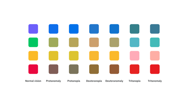
First, understand how color blindness determines what a person sees (and, in turn, how it affects your designs).
There are several different kinds of color blindness, which affect your ability to see red, yellow, and/or blue.
See the chart below for examples.
When you're designing a UI, color can be a great way to enhance information and make things easier to understand.
But if you rely too much on it, those who are color blind will have a difficult time.
Let’s walk through the main ways a designer should account for this:
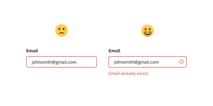
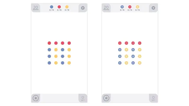
1) Never use color alone to convey meaning.
For example, if you only use color to show a form validation error, a color blind person will struggle to understand what's happening simply because they can't distinguish the colors.
Instead, include an error message and/or icon.
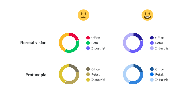
2) Utilize contrast in addition to different hues.
Contrast isn't an issue for most people who are color blind. Take advantage of that by darkening or lightening your colors and relying on contrast to convey information.
You can also add patterns or shape differences.
3) Run your designs through color blind checkers
There are lots of tools out there for this (most of them free).
It helps quite a bit to run your specific designs through a simulator to test how they will appear to a color blind person.
Here are four of my favorite color blind simulators:
👉 https://www.getstark.co/
👉 https://www.figma.com/community/plugin/733343906244951586/Color-Blind
👉 https://michelf.ca/projects/sim-daltonism/
👉 https://colororacle.org/
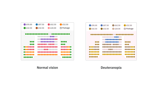
Bad example: ATG Tickets is one of the UK's largest ticketing websites.
When picking your seats, they rely entirely on color coding to show you price and availability.
This would be difficult (or impossible) for a color blind person to figure out.
If you remember one thing, make it this:
Always use color to support something your UI is already saying; never use it as the only way to communicate.
I'm building a field guide to color for product designers that will have more guides and tools related to accessibility.
If you're interested in this topic, be sure to check it out:

