@petergleick
Immediately makes me think of this:
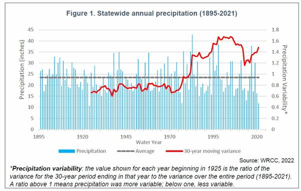
"Regardless of which complex system is being studied, there’s a way of telling whether it is approaching a tipping point. Its outputs begin to flicker. The closer to its critical threshold it comes, the wilder the fluctuations. ."
Elsewhere, Arctic sea ice extent anomaly since ca. 2000 as reflected in bigger wiggles. (Notably and weirdly, those graphs are made on a rolling basis including the "we broke it" era/data.)
https://www.theguardian.com/environment/2021/oct/30/capitalism-is-killing-the-planet-its-time-to-stop-buying-into-our-own-destruction