
Shout out to Nick last name withheld for doing the % math and letting us know that it should be 48% not 50% in their country. You are technically correct, and that is my favorite type of correct! Rounding down instead of rounding to nearest 5%, just for you. 👍
Another big (pun intended) shout out to the tester running through the on-boarding process with huge ass fonts on a tiny ass phone. Definitely caught a couple places I screwed up.
Thank you UIScrollView for saving my bacon on this one.
I spend a large portion of my day zooming fonts in and out, really wish Apple had a reset to default option.
@paul is it worth my effort to pitch for the paywall and this screen to be combined into one long view? 😁
@rjj you can pitch and we might do it, but it’s not a do today thing.
@paul Smart man.
@rjj do send it in, if nothing else we did the $1.99 thing.
@paul super! Glad it was helpful. The counterintuitive thing about Monthly is LTV is usually higher than Annual! So while the money isn’t upfront, it’s not bad to encourage it at all.
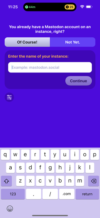
Consider removing “Example: “ here and if I tap continue while empty, fill as mastodon.social
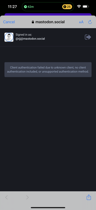
@paul It might save you X00 support tickets, tweets, and 1-star reviews if you special case this error, and show your own “Mastodon.Social is Overloading. Try again in 60 seconds.” system alert back on the app UI that blames the right party. Or auto fire the FAQ.
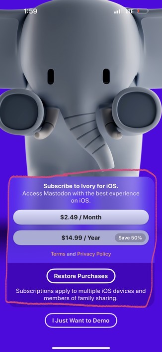
@paul for paywall, it’s a new-ish pattern to have the features listed in long scroll view, behind a floating pay button.
Using the content you already have, you could likely put the translucent round rect poking up from button of the screen, and let the content flow under it? But that’s too semi-fancy.
The KISS way is one scroll view:
IMAGE
FLOATING ROUND RECT
FEATURE LIST
Prob +5% conversion rate alone?

@rjj I'm going to let @mark look at all those. I just cook the pizza, he tells me where to put the ingredients.
We do show a section that let's you go the login help page when there's no login after bringing up the browser. Problem with being much more aggressive is that we can't really tell why it didn't login, server failure or user choosing cancel.
@paul Duh. Can’t believe I didn’t realize that. 🤦♂️
@mark moving the plans in the middle of first screen also let’s you list more features, cuz long is okay then. And a straight up list is actually a top 3 performing paywall layout. People just want a clear, concise list of the *limited features* they will/won’t get.
Replies
blurb
Post
blurb
Notifications
blurb
Themes
blurb