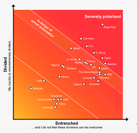
The problem with charts such as this (from Edelman's Trust Barometer) is that they portray authoritarian regimes as not polarized--because there is little or no freedom to express dissent. And they lead to the assumption that the most polarized nations are the most troubled when, in fact, they are the ones fighting off authoritarianism because they are threatened by it. Another way to look at this is to see the danger of *not* being polarized.