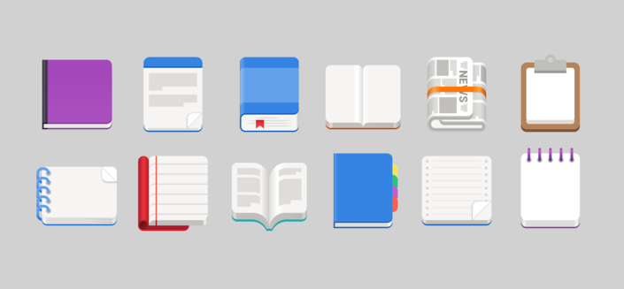
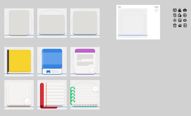
I'm updating our app icon template, so I've collected some of the different types of paper objects that we've drawn in the GNOME icon style over the years.

It's pretty cool how many different things you can do within the relatively tight constraints of the style and perspective.

Updated the template with new, more useful starter icons and symbolics in the new, rounder style ✨

https://gitlab.gnome.org/World/design/app-icon-preview/-/merge_requests/87

template: Update example icons (!87) · Merge requests · World / Design Tooling / App Icon Preview · GitLab

Various minor updates to the icon template: Update example icons to more generic and commonly used shapes Update symbolics examples to nicer, more...

GitLab
@tbernard huh, I never noticed devhelp icon was closer to fonts than contacts
@tbernard Never see most of this icons 😆 Icons is just fabulous, wish I see it more in nautilus!