I forget who round here recently praised the JetBrains mono font, but reading this and seeing it's licensed as open source, I am tempted to try it out: https://www.jetbrains.com/lp/mono/

Trying it out on #emacs, but I'm not instantly sold. I quite like the retro look of Courier New for code and I tend to find serifs improve readability. This has put the cat among the pigeons though, because I can't remember what the default font was previously...
@underlap make sure the ligatures are on.
I used FiraCode for some time, but seeing JetBrains mono made things very obvious.
The font makes diffs particularly clear to read, because ligatures add some horizontal space.
Bottom line is: it's not about the sheriffs, it's about the ligatures...
@codear Turning ligatures on appeared to be a bit fiddly. Maybe I was looking in the wrong place...
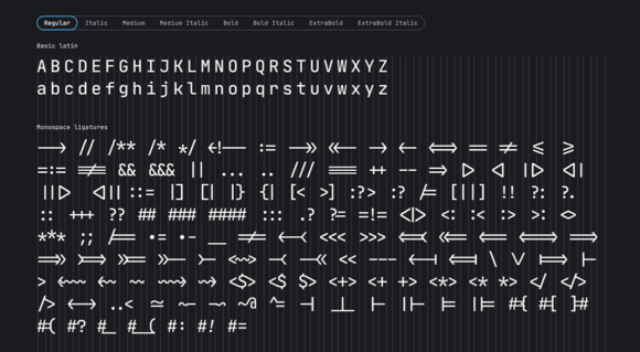
@codear Got ligatures working via https://github.com/mickeynp/ligature.el, I think. I don't see any obvious differences, but my emacs doesn't appear to be built with Cairo support. Is there some good text which would show off ligatures?

@underlap set it up with vscode to try it out.
You should immediately see changes in many places around the code, the most notorious example could be the comparison, but there's a ton more (comments, member access etc).
Ligatures are typically narrower than individual characters, leading to improved readability for many of us; YMMV, it's okay if this doesn't change anything for you. It's just a matter of subjective experience and preference 😉
@underlap I tend to use the default. If I can read it, it's fine.
@gregsdennis Me too, but I'm going to be doing some lecturing, so my terminal and emacs fonts will be consumed by others.
@underlap It was designed by a member of TypeType, a well-regarded type foundry. So it's probably pretty good.
@underlap I have been using it for a long time and don't want to change to something else. I even used it in my new tool I just released...
https://github.com/pongasoft/re-edit/releases/download/v1.0.0/re-edit-dark.png
https://github.com/pongasoft/re-edit/releases/download/v1.0.0/re-edit-dark.png