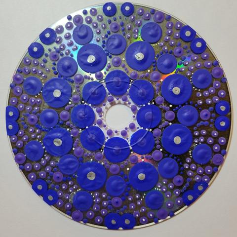
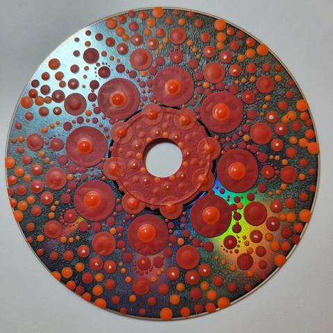
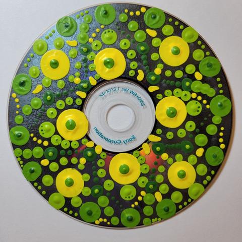
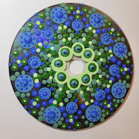
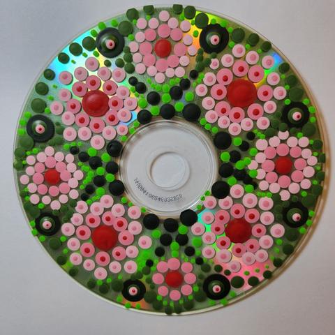
Every January (since 2014 I believe), an artist friend of mine in Half Moon Bay, CA facilitates a FB group in the making of a set of 12 mandalas to represent the months of the coming year for us. Each participant does their own thing, medium & process-wise. I've been doing it since 2016. Normally, the plan is to make 1 mandala/day for the 1st 12 days of the year. I don't always succeed yet I'm a day early this year with #1 - January - Repeat. Details in alt text. #2023NewYearMandalas #MastoArt

(Going to post the rest of my #2023NewYearMandalas in a sequence of replies to my 1st post on the topic.)

Here's #2 - February - Hope.

I'm using a bunch of unused CDs & DVDs we found during our annual attic cleanout as the substrates, lightly sprayed with clear gesso. The dots are primarily acrylic paint, with some paint marker, Sharpie, & gel pen thrown in. It's intended to be an opportunity for art meditation. Gets my year off to a nice start. #MastoArt

#3 - March - Sprout

(This is the 3rd in my #2023NewYearMandalas series. Follow the thread back if you'd like to read more about this endeavor.)

The word associated with each mandala arises from contemplation of the work. Sometimes I know going in, sometimes it comes as I'm mixing the colors or placing the dots.

#MastoArt

#4 - April - Emerge

This 4th of 12 #2023NewYearMandalas completes the 1st of 3 sets. Each set of 4 will explore an aspect of color theory. The 1st set uses analogous color schemes, the 2nd will be complementary, and the 3rd will be monochrome.

I have 3 appropriately-sized shadow boxes I bought some years ago for a project that never happened, so I'll use them for this years mandalas and hang them in the big empty space above the bathroom towel rack.

#MastoArt

#5 - May - Bloom!

#2023NewYearMandalas

Used red & green for the 1st of 4 mandalas with complementary color schemes. Turned out a bit more Christmasy than I'd hoped. Played with tints of the Lipstick Red & shades of the Lime Green in the set of 18 FolkArt matte acrylics I bought for this project. Knowing what I know now, I wish I'd just gotten big tubes of the primaries, white, & black.

#MastoArt

#6 - June -Shift

#2023NewYearMandalas

Tried purple & yellow for this mandala's complementary color scheme. Made 3 tints of the purple & a tone of the yellow by adding some of the lightest purple tint to it. I'm having a lot of fun with my exploration of color theory!

Edit - Maybe that was 4 tints of the purple.

#MastoArt

@debwolfe I like this color combination! Looking forward to seeing what more you come up with.
@jeridansky Thank you! I'm out of my color comfort zone with this project, especially these complementary schemes. Hoping to expand how I use color in my ceramics as a result & develop a better eye for color in my photography.