Check out how land is used in the United States. Cows take up the most space!

https://www.bloomberg.com/graphics/2018-us-land-use/
First in a 🧵 of #2022TopToots

Here’s How America Uses Its Land

The 48 contiguous states alone are a 1.9 billion-acre jigsaw puzzle of cities, farms, forests and pastures.

Bloomberg.com
Chocolate consumption and Nobel Prizes: A bizarre juxtaposition if there ever was one

Scientific American Blog Network

This map shows only people. It is a beautiful illustration of where people are concentrated.

If you squint, you can see Australia and New Zealand.

Map by Alasdair Rae https://www.visualcapitalist.com/cp/3d-map
Third in a 🧵 of #2022TopToots

3D Map: The World’s Largest Population Density Centers

What does population density look like on a global scale? These detailed 3D renders illustrate our biggest urban areas and highlight population trends.

Visual Capitalist

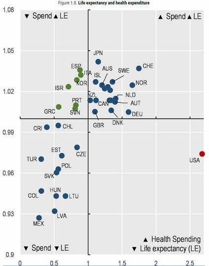
Check out this scatterplot of health spending per capita (x axis) & life expectancy (y axis) in OECD countries (lines = averages).

The United States sits alone in the bottom right quadrant due to its much higher spending and below-average life expectancy.

More info: https://oecd-ilibrary.org/sites/ae3016b9-en/1/3/1/index.html?itemId=/content/publication/ae3016b9-en&_csp_=ca413da5d44587bc56446341952c275e&itemIGO=oecd&itemContentType=book
Fourth in a 🧵of #2022TopToots

Home

OECD's dissemination platform for all published content - books, podcasts, serials and statistics

Estimated gender pay gap within job (same occupation at same firm)
🇯🇵 Japan 26%
🇰🇷 S Korea 19%
🇺🇸 US 14%
🇩🇪 Germany 13%
🇪🇸 Spain 12%
🇮🇱 Israel 12%
🇨🇦 Canada 12%
🇳🇴Norway 9%
🇫🇷 France 7%
From study https://nature.com/articles/s41562-022-01470-z#
by @OlivierGodechot & 28 others
Fifth in a 🧵 of #2022TopToots
Be sure to catch the end of this clever NASA "climate spiral" video showing monthly global temperature changes between 1880 and 2021
https://climate.nasa.gov/climate_resources/300/video-climate-spiral/
Sixth in a 🧵 of #2022TopToots
Video: Climate Spiral – Climate Change: Vital Signs of the Planet

The visualization shows monthly global temperature anomalies (changes from an average) between the years 1880 and 2021.

Climate Change: Vital Signs of the Planet
This amazing map shows travel time from London to the rest of the world in 1881
Seventh in a 🧵 of #2022TopToots
@conradhackett amazing how much closer the world has gotten since then.