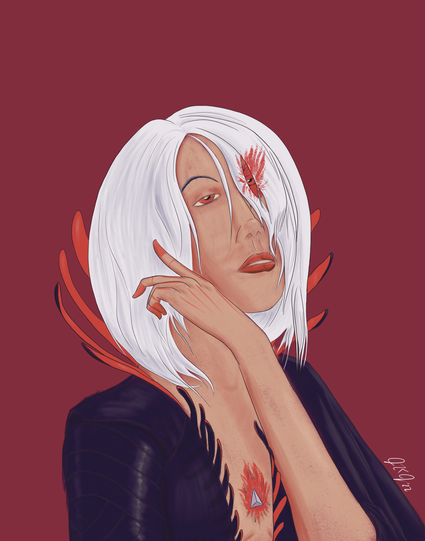
Like I said yesterday, the Die series is an excellent piece of #comics. As promised, I’m beginning a series of portraits for the six members of the party beginning with Ash. #diecomic #MastoArt #fanart #portrait #digitalpainting
I've seen a couple folks on the local timeline express an interest in discussing art process stuff, which is honestly kind of a refreshing ask. I'd like to talk a little bit about the process for this piece since it diverges a little bit from the way I usually do my work.
In most of my pieces, because I focus on character art, I typically begin with a neutral base color to paint clipped layers onto as flats before I go back and paint in shadows and highlights.
It's taken me a couple years to get comfortable with painting directly on my flat layers; when I first started working in digital I'd have a distinct layer for every single color--we're talking upwards of fifty layers for some pieces. 😅
Increasing the native resolution I work in helped me get over that impulse pretty quickly!
For example, these pieces both have relatively simple palettes, but both have about thirty layers with the majority devoted to coloring effects added over flats. Their resolution is 132 dpi, which means Procreate allowed me about 115 layers to work with.
Compare those with this piece, which is 300 dpi on a 14”x11” canvas and uses about the same number of layers. I think the coloring on this piece is generally better, even setting aside the flourishes I did to make the background less plain. There are still a few layers where I did some filter tricks to create some lighting effects, but the shades and highlights on the figure are painted directly on the flats.
Part of this shift I can attribute to sheer quantity of work I’ve done and the natural experimentation that comes with extended practice. Part of it is due to internalizing coloring methods I’ve learned from reading other artists’ discussions of their own process.
With the *Die* piece at the top of this thread, I’m refining a less rigid coloring process that’s based more in color blocking with a textured brush that doesn’t completely obscure lower layers. It’s how I got the sort of freckled effect on the skin.
I’m also trying to think more carefully about overall palette for my pieces. My usual process for other work involves deciding on my base layer at the end and turning down opacity on my color layers to harmonize.
In this piece, I decided to take the dominant palette from the book as inspiration. I chose my own reds, blacks, and whites, but I knew those were the colors for the piece and tried to think about how their shades and tints would reflect the warm light I wanted to convey in the piece.

Anyway, that’s probably enough for now. I forgot to hashtag this thread, so!

See above for ramblings about coloring process and layer neepery. Also some art!
#art #artprocess #coloring #procreate

Was thinking some more about process discussion and started wondering if it’d be easier to explain with the video from my Procreate session.