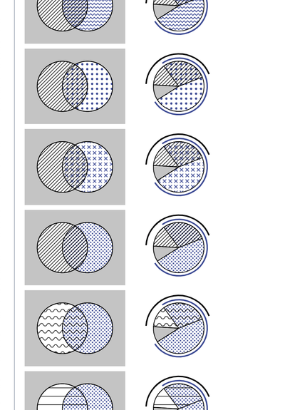
I had a stupid/clever idea about a pie chart that adds up to more than 100%. Still haven't found the right textures (or actual data to plot).
@alexwein So like giving it a Venn diagram purpose? I can see that work!
It only can work with two or three categories per pie chart I guess, because then all overlap-options can be represented in said pie chart. Actually, the three-category one doesn't allow for an "all three" option either. Ok guess I can see some the limitations here, hahaha
But still, neat idea!