Small Rental Hacks That Actually Transform Your Space Without Touching the Walls
Renting a small apartment is a creative constraint. You sign the lease, move in your boxes, and then stare at a room that feels like it belongs to someone else — because technically, it does. The landlord’s beige paint stays. The carpet stays. The oddly placed outlet stays. And somehow, you’re supposed to make this place feel like home.
The good news? That constraint is an invitation. Some of the most beautifully designed small rental spaces exist because their owners stopped fighting the limitations and started working with them. This article is about exactly that — practical, affordable, renter-friendly decoration strategies that create real visual impact without risking your security deposit.
These aren’t “put a plant on the windowsill” tips. These are spatial and design thinking tools dressed up as DIY hacks — specifically built for the rental reality most of us actually live in.
Why Are Small Rental Apartments So Hard to Decorate?
The challenge isn’t size. Plenty of compact spaces feel expansive and intentional. The challenge is the combination of restrictions: no drilling, no painting, no permanent fixtures, and very little control over the base layer of the room.
Most renters try to decorate around those restrictions — layering soft furnishings over bad carpet, hanging things with command strips, hoping the whole thing reads as “intentional.” Sometimes it works. Often, it just looks like a room trying too hard to distract from itself.
What actually works is something I call Constraint-Forward Design — a framework where you treat the permanent, unchangeable features of the rental as the starting point for your aesthetic, not the enemy of it. You design with them, not around them.
This reframe changes everything. Suddenly, the beige walls aren’t a problem — they’re a neutral canvas. The awkward alcove isn’t wasted space — it’s a built-in opportunity for a reading nook. The rental apartment stops being a placeholder and starts becoming a deliberate design challenge.
The Three Zones of a Small Rental: A Spatial Framework
Before you buy anything or move a single piece of furniture, map your space using what I call the Three-Zone Rental Model: the Fixed Layer, the Flex Layer, and the Float Layer.
Zone 1: The Fixed Layer
This is everything you cannot change — floors, walls, ceiling height, window placement, built-in shelving, and architectural quirks. Most renters spend enormous energy being frustrated by this layer. Instead, study it. What colors are already present? Furthermore, what shapes dominate the room? And what does the light do at different times of day?
Your entire design strategy should treat the Fixed Layer as the brief. You’re designing in response to it.
Zone 2: The Flex Layer
This includes large, moveable elements — your sofa, bed frame, dining table, bookshelves, and rugs. These pieces set the proportional logic of the room. They define flow, scale, and rhythm. Poor placement here creates visual chaos that no amount of decorative layering will fix.
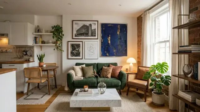
In a small rental, the Flex Layer is where 80% of your budget and attention should go. One well-chosen, correctly proportioned rug does more work than twelve throw pillows.
Zone 3: The Float Layer
This is everything decorative — art, lighting, plants, textiles, objects. Most people start here. That’s the mistake. The Float Layer only reads clearly when the Fixed and Flex layers are already working. Think of it as punctuation, not content.
Small Rental Hacks That Use the Fixed Layer as a Design Tool
Now for the practical part. These small apartment decorating tips are grounded in the Three-Zone framework. Each one is damage-free, budget-conscious, and designed to create genuine visual change rather than decoration noise.
Hack 1: Use Peel-and-Stick Wallpaper as a Single Accent Panel
Covering an entire room in removable wallpaper rarely works in small rentals. The scale goes wrong, the pattern overwhelms, and the removal process often leaves residue. However, one panel — one single wall or section, treated like an art installation — changes the entire spatial reading of the room.
Choose a pattern that directly responds to your Fixed Layer. If your floors are warm honey oak, pull a botanical or warm geometric. If your walls are cool gray, go for high-contrast black-and-white or a deep, moody tonal pattern. The panel anchors the room’s visual hierarchy without consuming it.
This approach is what I call Focal Point Anchoring — deliberately creating one place in the room where the eye goes first, which paradoxically makes everything else feel more resolved.
Hack 2: Layer Rugs to Redefine Space Within Space
In an open-plan small rental, the biggest problem is often that every function shares the same visual plane. The sofa bleeds into the dining table, which bleeds into the home office corner. Everything exists on one undifferentiated floor.
Layering two rugs — typically a flat-weave base rug under a smaller, textured statement rug — creates what designers call zone demarcation without walls. Your living area becomes architecturally distinct from your dining area, not because anything physically separates them, but because the floor suddenly does.
For small apartments, keep the base rug in a neutral, low-pile material. The top layer can be more expressive — a Beni Ourain-style, a vintage kilim, or a natural jute circle rug works well. The contrast in texture does the heavy lifting.
Hack 3: Apply the Height Illusion Principle
Low ceilings are one of the most common Fixed Layer challenges in rental apartments, especially in older urban buildings. The Height Illusion Principle states that vertical lines, floor-to-ceiling elements, and upward-pointing forms trick the eye into reading a room as taller than it is.
Practically, this means: hang curtains from the highest possible point on the wall, not from the window frame. Tall, narrow bookshelves work better than wide, low ones. Vertical striped textiles — a tall floor lamp, a pendant hung low over the dining table — draw the eye upward and create implied vertical space.
Conversely, avoid horizontal accents at mid-height. Gallery walls at eye level, long, low sideboards, and horizontal striped rugs all compress the room visually. This is the single most underused principle in rental decorating.
Hack 4: Use Mirrors as Spatial Architecture
Everyone knows mirrors make rooms feel bigger. Fewer people understand why or how to use them strategically. A mirror placed opposite a window doesn’t just bounce light — it creates a second apparent opening in the room. Your brain registers it as a doorway or window to another space. This is Perceptual Expansion in action.
For maximum effect, use a large-format mirror — at least 50% of the wall height — and position it perpendicular to your main light source, not directly opposite it. A mirror facing directly into another mirror creates visual depth but also visual noise. A mirror that catches the window’s light at an angle floods the room more naturally.
Leaning large mirrors against walls also avoids drilling, making them ideal for renter-friendly setups. An oversized leaning mirror against a neutral wall reads as both a functional object and a sculptural piece.
Hack 5: The Negative Space Rule for Small Rentals
Small apartments consistently suffer from over-decoration. The instinct to fill every surface, corner, and wall with objects is understandable — it feels like making the space “yours.” But visual clutter in a small room doesn’t personalize it. It shrinks it.
The Negative Space Rule is simple: for every styled surface in your apartment, leave an adjacent surface completely clear. For every shelf you fill, leave the shelf above or below empty. For every corner with a plant, leave the corner beside it open.
This isn’t minimalism as an aesthetic choice. It’s spatial breathing room. Your styled areas need context — and that context is emptiness. The eye needs somewhere to rest so it can appreciate where it’s directed.
Furniture Strategies for Small Rental Apartments
Invest in One Piece That Doesn’t Apologize for Itself
Small rental budgets tempt you toward safe, inexpensive, forgettable furniture. Resist this logic. One genuinely distinctive piece — a sofa in an unexpected color, a dining table with real material presence, a vintage dresser with strong proportions — does more design work than an entire room of cautious, low-cost filler.
This is the Anchor Piece Strategy: identify the single most viewed spot in your apartment and allocate disproportionate budget there. Everything else can be IKEA. That one piece should feel considered and specific to you.
Multi-Function Is Not About Folding Tables
The design media loves to promote transforming furniture — fold-down desks, sofa beds, nesting tables — as the solution for small spaces. These pieces rarely perform as well in real life as they do in the product photography. They require effort to transform, they often look utilitarian, and they communicate “I live in a small space” rather than “I live in a considered space.”
True multi-functionality in small rental design is about pieces that serve multiple visual and spatial roles simultaneously. A large vintage trunk as a coffee table: surface, storage, and sculptural object. A tall ladder shelf as a room divider and display: two spatial functions, one piece. Think in layers of use, not in transformation sequences.
Lighting Hacks That Redesign Your Rental for Free
Lighting is the most underestimated variable in small apartment decoration. Overhead lights — the default in virtually all rental apartments — produce flat, undifferentiated illumination that flattens texture, erases architectural depth, and makes spaces feel like waiting rooms.
The fix costs almost nothing and requires no installation. Turn off the overhead light entirely and replace it with a layered system of table lamps, floor lamps, and clip-on spotlights. This is Lamp-First Lighting — a practice of designing the room’s atmosphere exclusively through portable, low-cost light sources.
Use at least three separate light sources at different heights. Vary the color temperature: warmer sources (2700–3000K) in the living and sleeping zones, slightly cooler (3500K) for task areas. The result is a room that looks photographed — dimensional, atmospheric, alive.
Edison Bulbs and the Warmth Trap
One caveat on warmth: very warm bulbs (below 2700K) in small spaces create a brownish, cave-like ambiance that photographs terribly and reads as dimness rather than atmosphere. The sweet spot for rental apartments is 2700–2900K — warm but clear. Use this range for ambient sources and save the lowest wattage for purely decorative accents.
Plant Placement as Spatial Design
Plants in rental apartments often get treated as decoration — objects placed wherever there’s a surface available. But plants are actually one of the most powerful spatial design tools you have. They introduce organic form, vertical rhythm, and visual texture that no manufactured object can replicate.
Use what I call the Plant Hierarchy System: one large, statement plant (floor-level, architectural — a fiddle-leaf fig, monstera, or tall Ficus) that anchors the room’s organic layer; two or three medium plants (tabletop or shelf-height) that extend the visual rhythm upward; and a few small plants or trailing varieties at high points to draw the eye upward.
This isn’t about collecting plants. It’s about using plants as spatial markers at deliberate heights — the same way an architect places columns or windows to organize a room’s vertical experience.
The Textile Layering Method for Rental Warmth
Bare rental apartments feel cold, not because they lack objects but because they lack tactile variety. Smooth walls, hard floors, and basic furniture create rooms where everything reads at the same sensory frequency. Textiles solve this at low cost.
The Textile Layering Method works in three steps. First, establish a base textile — your rug — in a neutral, large-scale pattern or solid. Second, add a middle textile — your sofa throw or bed linen — in a complementary texture (chunky knit against linen, velvet against cotton). Third, introduce a contrasting textile — your cushions or curtains — in the room’s accent color or the most expressive pattern in the scheme.
Three textile layers, three different textures, and a consistent color logic. That’s the formula. Anything beyond it risks crossing from layered warmth to visual noise.
Color Strategy for Renters Who Can’t Paint
Not painting your walls doesn’t mean surrendering to beige. Color strategy in a rental apartment operates through what I call the Color Carrier System — introducing your palette through large, movable objects rather than fixed surfaces.
Your rug is your primary color carrier, your sofa or largest textile is your secondary carrier, and your curtains, if full-length, become your tertiary carrier. Together, these three elements deliver more color impact than a painted wall because they introduce color at multiple heights and scales simultaneously.
The most effective rental color strategies are usually built around one unexpected anchor color — a deep teal sofa, a terracotta rug, an olive green linen curtain — held in check by neutrals at every other layer. The contrast is what creates visual intelligence. A room where everything matches reads as timid. A room where one thing is bold, and everything else holds space for it, reads as designed.
Small Rental Hacks for the Kitchen and Bathroom
These are the rooms most renters give up on entirely. Landlord fixtures, cheap tiles, fluorescent lighting — the kitchen and bathroom often feel completely beyond redemption. They’re not.
Peel-and-Stick Tile for Backsplashes
Modern peel-and-stick tile has genuinely improved. The best products on the market now produce finishes that photograph as real ceramic and withstand kitchen moisture when properly applied. A backsplash transformation takes a weekend and costs under $100 for most small rental kitchens. Removal is clean when done correctly.
The key is surface prep and edge finishing. Clean the surface with alcohol before application. Use edge trim strips at exposed ends. Apply slowly in consistent rows, not diagonally. The result reads as a proper tile installation in photographs and in person.
Contact Paper as a Surface Transformer
The wrong contact paper application looks like contact paper. The right application looks like stone, marble, or solid color lacquer. The difference is in material quality and application precision. Invest in premium contact paper — thicker, with matte or textured finish — and apply it to countertops, drawer fronts, or cabinet doors using a squeegee and deliberate bubble-elimination technique.
Used on one surface — a single countertop or one set of cabinet doors — this reads as a deliberate material choice rather than a cover-up. Used everywhere, it reads as exactly what it is.
The DIY Rental Upgrade That Nobody Talks About
Hardware replacement. Specifically, replacing the drawer pulls, cabinet knobs, and door handles throughout your apartment. These come with a screwdriver and cost between $3 and $20 per piece. They take twenty minutes to swap. And they transform the perceived quality of every surface they touch.
Standard rental hardware is the cheapest possible chrome or brushed nickel. Replacing it with matte black, antique brass, or ceramic knobs doesn’t just look better — it signals material consideration. It tells anyone who enters the space that decisions were made. That’s the difference between a rental and a home that happens to be rented.
Keep the originals in a labeled bag for move-out day. Reinstall them. Take your upgraded hardware with you. This is the most cost-per-impact efficient upgrade available to renters.
What the Future of Small Rental Design Looks Like
The rental design market is moving. Peel-and-stick products are improving rapidly in quality and expanding in variety. Modular, deposit-safe furniture systems designed specifically for renters are emerging as a mainstream product category. And as remote work keeps more people in their apartments for more hours, the demand for rental spaces that perform as genuine environments — not just sleeping locations — will only grow.
I think we’ll see a formal design discipline emerge around Renter-Adaptive Interiors within the next five years — a recognized category combining temporary installation techniques, modular furniture systems, and spatial psychology, specifically designed for non-ownership living. This isn’t a niche market. It’s the primary reality for millions of urban dwellers globally.
The frameworks outlined in this article — Constraint-Forward Design, the Three-Zone Rental Model, Lamp-First Lighting, the Color Carrier System — are early articulations of that emerging discipline. They’re tools for designing well within limits. And designing within limits, it turns out, is one of the most creatively productive conditions there is.
Frequently Asked Questions About Small Rental Apartment Decorating
What are the best small rental hacks that don’t damage walls?
Peel-and-stick wallpaper panels, large leaning mirrors, tension rod curtain systems, and adhesive-backed floating shelves all create visual impact without drilling or permanent adhesion. Hardware replacement — swapping out drawer pulls and cabinet knobs — is also entirely damage-free and widely overlooked.
How do I make my small rental apartment look bigger?
Apply the Height Illusion Principle: hang curtains from ceiling height, use tall vertical furniture, and keep horizontal mid-height elements minimal. Use one large mirror positioned to catch natural light. Implement the Negative Space Rule — leave at least one surface or corner clear for every styled one. Prioritize a large area rug over multiple small rugs.
What is the most affordable DIY decorating tip for renters?
Hardware replacement offers the highest visual return at the lowest cost. Replacing standard rental cabinet knobs and drawer pulls with matte black or brass alternatives costs $20–$60 total and is entirely reversible. Lamp-First Lighting — turning off overhead lights and replacing them with layered portable lamps — is equally affordable and transforms the room’s atmosphere immediately.
Can I use peel-and-stick wallpaper in a rental apartment?
Yes, with caveats. Apply it to a single accent panel rather than full walls. Test adhesion in a hidden corner first. Avoid textured walls, which reduce adhesion and increase removal damage. Use premium brands with clean-removal guarantees, and remove slowly at a 45-degree angle when the time comes.
How do I add color to a rental with white or beige walls?
Use the Color Carrier System. Introduce your palette through large moveable objects — your rug as primary carrier, your sofa or main textile as secondary, and your curtains as tertiary. One bold anchor color in a neutral context creates more visual intelligence than a multi-color scheme. Deep teal, terracotta, olive, and dusty rose all perform well against standard rental neutrals.
What is the best rug size for a small apartment?
Bigger than you think. The most common rug mistake in small apartments is choosing a rug that’s too small — one that floats in the middle of the room without anchoring the furniture around it. In a living room, at minimum, the front legs of your sofa and chairs should sit on the rug. In a bedroom, the rug should extend at least 18–24 inches beyond the sides and foot of the bed.
How can I make rental kitchen cabinets look better without replacing them?
Replace the hardware first — it takes twenty minutes and costs very little. Apply premium contact paper to drawer fronts or a single cabinet door as a material accent. Add under-cabinet LED strip lights for warmth and depth. Display a small number of beautiful everyday objects on open shelves rather than storing everything behind closed doors.
Check out WE AND THE COLOR’s Interior Design category to learn more.
#apartment #DIY #home #smallApartment #smallRental #upcycling