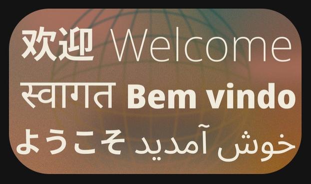
Schriftartwechsel bei GNU/Linux.ch
Unsere Website hat den Font gewechselt. Statt Microsofts Segoe, verwenden wir jetzt Noto. Das war längst überfällig. Wie gefällt euch das neue Schriftbild?
Schriftartwechsel bei GNU/Linux.ch
Unsere Website hat den Font gewechselt. Statt Microsofts Segoe, verwenden wir jetzt Noto. Das war längst überfällig. Wie gefällt euch das neue Schriftbild?
Hear my song
Now People won't ya listen and
Sing along
oh! You don't know what you're #missing
Any little song that you know.
https://youtu.be/jYKy9qYNPDw?si=3Hbvej0lBFQ2ww6i
#LedZeppelin #Transitions #segoe #bridge #crunge #thecrunge #johnbonham #jimmypage #robertplant #johnpauljones #petergrant #atlanticrecords #theocean #therainsong #rainsong

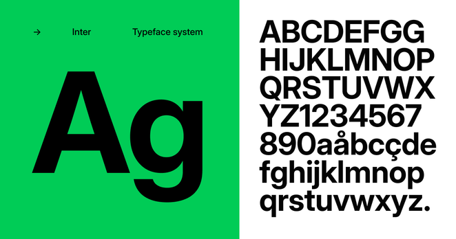
I know it's weird picking on #fonts , but I really don't care for #cantarell It's *fine* but it's not a font that looks good being looked at every day, such as the #GNOME desktop. I recently discovered the #inter font and after using it as my general GUI font for the past two weeks, it's incredible how much more legible it is.
In a #Windows context, it's like comparing #calibri to #segoe One is fine, and the other is hands down better.