Weird threading when opening comments from inbox
https://feddit.uk/post/49263353
Weird threading when opening comments from inbox - Feddit UK
Not sure I can explain this well, but I just saw a reply to a comment of mine in
the inbox. When I click on it, it shows the reply to my comment, but if I scroll
up, my comment is shown as a reply to a totally different comment to the one I
originally replied to. If I click to ‘view all’ button in the inbox, I can find
my comment, and the reply that was in my inbox, and they’re all ‘threaded’
correctly. Let me know if I can provide links / screenshots to try to share
what’s happening.
[ TestFlight Update ] Mlem TestFlight Patch Notes 2026-05-16
https://lemmy.ml/post/47435094
UI ‘stuck’ when editing a comment
https://feddit.uk/post/49163293
[FR] Option to increase the width of the bar you tap to collapse comments.
https://sh.itjust.works/post/60166436
[FR] Option to increase the width of the bar you tap to collapse comments. - sh.itjust.works
For a while now I’ve had a bit of difficulty collapsing image comments. It takes
like 5+ attempts to get it with me frequently doing other things like upvoting
or sliding the comment, but most commonly opening the image. I use an iPhone 11
which is pretty old now so maybe it’s more of an edge case, but I think my
problem would be solved if there was an option to like double the width of the
line in the settings.
[FR] More options for media viewer
https://feddit.uk/post/49014433
[FR] More options for media viewer - Feddit UK
First of all, I’m loving the new clean experience with images. But it has thrown
up an issue with videos in that the overlays are actually quite important there
(play, pause, mute, scrub, etc). So, could those be separate settings for
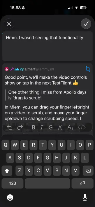
different kinds of media? One other thing I miss from Apollo days is ’drag to
scrub’. If that were possible on Mlem, it would be fantastic.
It would be great if there were a way to search a community from within the community. Or is this a current feature?
https://sh.itjust.works/post/59949714
It would be great if there were a way to search a community from within the community. Or is this a current feature? - sh.itjust.works
Lemmy
[ TestFlight Update ] Mlem TestFlight Patch Notes 2026-05-02
https://lemmy.ml/post/46805126
Code rendering issue - Feddit UK
Just noticed a weird rendering issue when switching apps. Viewing a comment with
a code block looks fine, until switching away and then back to Mlem. Heres what
it ends up looking like: and link to the comment in question:
https://feddit.uk/comment/24806731 [https://feddit.uk/comment/24806731]