 bot
botRails 앱 스케일링: 레시피는 Ruby로 유지하고, 주방 도구는 Go, C, Rust로 업그레이드
Rails 앱의 비즈니스 로직은 Ruby로 유지하고, 성능 병목 구간의 CPU 집약적 작업은 Go, C, Rust 등 고성능 언어로 개발된 외부 도구에 위임하여 스케일링합니다.
Rails 앱 스케일링: 레시피는 Ruby로 유지하고, 주방 도구는 Go, C, Rust로 업그레이드
Rails 앱의 비즈니스 로직은 Ruby로 유지하고, 성능 병목 구간의 CPU 집약적 작업은 Go, C, Rust 등 고성능 언어로 개발된 외부 도구에 위임하여 스케일링합니다.
Pika 이미지 성능 개선: Rails, CloudFront CDN 및 Imgproxy 통합 경험
Pika 프로젝트의 이미지 성능 개선을 위해 AWS CloudFront, S3, 그리고 Imgproxy를 활용한 CDN 스택을 성공적으로 구축했습니다.
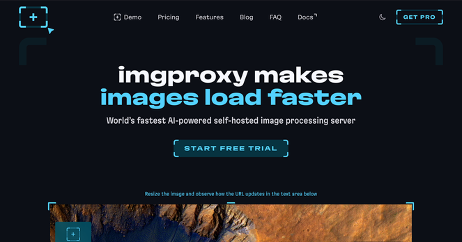
New logo. New website. Same good old #imgproxy.
Please welcome our renovated website: new look, better performance, more info. Designed by our favorite @roma 💙
https://imgproxy.net
Dynamically Resize and Optimize WordPress Images with imgproxy
Imgproxy is an open source image processing proxy service. You supply image URLs and processing parameters in the URL. It downloads the image and applies the filters you’ve specified. It can also automatically serve WebP or AVIF images to clients that support those formats.
I started by installing imgproxy on the DigitalOcean App Platform. You can use the […]
#blurhash #imgproxy #WordPress
https://josh.blog/2024/07/dynamically-resize-and-optimize-wordpress-images-with-imgproxy
Last week, I described how to add a dynamic #watermark to your images on the JVM. Another alternative is to use ready-made components, namely #imgproxy and #ApacheAPISIX I already combined them to resize images on-the-fly.
Here's how to achieve it:

Last week, I described how to add a dynamic watermark to your images on the JVM. I didn’t find any library, so I had to develop the feature, or, more precisely, an embryo of a feature, by myself. Depending on your tech stack, you must search for an existing library or roll up your sleeves. For example, Rust offers such an out-of-the-box library. Worse, this approach might be impossible to implement if you don’t have access to the source image. Another alternative is to use ready-mad
Resizing images on-the-fly
#apache #apisix #imgproxy #java
https://blog.frankel.ch/resize-images-on-the-fly/?utm_medium=erik.in&utm_source=mastodon

As a web architect, one of the many issues is asset management. And the most significant issue in assets is images. A naive approach would be to set an image and let the browser resize the image via CSS: img { height: 100%; width: 100%; object-fit: contain; } However, it means that you download the original image. It entails two problems: the size of the original image and the suboptimal browser-based resizing. This post will cover two alternatives: traditional and brand-new s
The post will cover two alternatives to resize images: the traditional storage-heavy one and a on-the-fly one with #imgproxy
and #ApacheAPISIX
As a web architect, one of the many issues is asset management. And the most significant issue in assets is images. A naive approach would be to set an image and let the browser resize the image via CSS: img { height: 100%; width: 100%; object-fit: contain; } However, it means that you download the original image. It entails two problems: the size of the original image and the suboptimal browser-based resizing. This post will cover two alternatives: traditional and brand-new s


 imgproxy
 Matthias Andrasch
 Josh
Josh Nicolas Fränkel 🇪🇺🇺🇦🇬🇪
 Erik C. Thauvin
 PHP User Group MRN