 WE AND THE COLOR
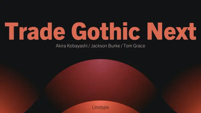
Trade Gothic Next Font Family from Linotype
Linotype’s Trade Gothic Next Is the Typeface That Refuses to Be Replaced
While other typefaces just age, Trade Gothic Next gets sharper. Originally drawn by Jackson Burke for Mergenthaler Linotype starting in 1948, this sans-serif family spent decades as the workhorse of American commercial printing. Then, in 2008, Linotype’s type director Akira Kobayashi and American type designer Tom Grace stepped in. They didn’t reinvent the family. They refined it—systematically, surgically, and with obvious respect for what Burke built. The result is one of the most versatile grotesque typefaces available today.
The family is available on MyFontsWhat makes the Trade Gothic Next font family worth a close look right now? Because grotesque sans serifs are everywhere in branding, editorial, and digital design—and most of them look interchangeable. Trade Gothic Next doesn’t. It carries a specific mid-20th-century American character that contemporary geometric sans serifs simply can’t replicate. That character is now backed by a 17-style type system built for demanding professional use.
Trade Gothic Next Font Family by Linotype The family is available on MyFontsWhat Exactly Is Trade Gothic Next, and How Did It Get Here?
Trade Gothic started as a family of condensed jobbing faces. Burke released the earliest weights in 1948, naming them plainly—Gothic No. 17 through No. 20. These were condensed sans-serifs designed for commercial trade work: price lists, catalogs, and newspaper ads. Utility was the point.
Over the next 12 years, Burke expanded the family as Linotype’s director of typographic development. He added regular-width designs and gave the collection its lasting name. But the expansion happened incrementally, without a master plan. Inconsistencies accumulated in terminals, spacing, weight distribution, and stroke endings. The family worked, but it didn’t cohere.
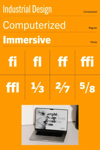
The 2008 revision addressed all of that. Under Kobayashi’s direction, Grace redesigned and expanded the full family. He corrected the terminals and stroke endings, improved the symbols, tightened the spacing and kerning, and also added compressed widths and heavier weights that the original never offered. The result is a family that reads as a single, unified system rather than a collection of related but mismatched designs.
The Designers Behind the Revision
Akira Kobayashi is one of the most respected type directors working today. His editorial judgment shapes the Linotype library as part of Monotype. Tom Grace trained at the MA Typeface Design program in Reading—one of the most rigorous type design programs in the world. That combination of institutional authority and technical precision shows in every corner of Trade Gothic Next. This wasn’t a quick digitization job. It was a considered redesign.
The Trade Gothic Next Font Family Structure Explained
Seventeen styles sounds like a lot. But the structure is logical once you understand it. The family organizes around three width classes: regular, condensed, and compressed. Each class serves a different typographic role.
Regular Width Styles
The regular-width designs come in four weights—light, regular, bold, and heavy. Each Roman has a matching italic. That gives you eight styles at regular width. These work well for body text, subheadings, and any context where you need readable prose at normal tracking.
Condensed Styles
The condensed designs mirror the regular-width structure: four weights, each with an italic, for another eight styles. Condensed sans-serifs earn their place in tight editorial layouts, data-heavy tables, and small-format printing where horizontal space is always at a premium.
Compressed Styles
The compressed designs are new to the revised family. They come in three weights—regular, bold, and heavy—without italics. That adds the final three styles to reach 17 total. The compressed cuts are purpose-built for headlines. Set them at large sizes, and they create an enormous visual presence without taking up the full column width.
The Typographic Efficiency Framework
I use the term Typographic Efficiency to describe what Trade Gothic Next enables at a system level. It refers to a typeface’s ability to serve multiple typographic roles—display, text, caption, data—without requiring a secondary typeface. Trade Gothic Next scores exceptionally high on TE. You can run an entire publication, interface, or brand identity using only this family. That’s rare, and it’s worth paying for.
Trade Gothic Next vs. the Original Trade Gothic
If you’ve used the original Trade Gothic, you already know its strengths. The question is what the Next revision actually changes in practice.
The most immediately visible improvements are in the spacing and kerning. The original Trade Gothic had uneven rhythm in certain letter pairs—pairs that set awkwardly in headlines without manual adjustment. Trade Gothic Next handles those pairs cleanly by default. For production typographers, that alone justifies switching.
The terminals are also more consistent. Burke’s original had terminal angles that varied across the family in ways that weren’t obviously intentional. The revision standardizes these details without flattening the family’s character. It feels more deliberate without feeling sterile.
The Personality Preservation Principle
One risk in revising a classic typeface is sanitizing it. Many digital revivals of 20th-century grotesques end up looking polished but lifeless—their quirks corrected away. Trade Gothic Next avoids this through what I call the Personality Preservation Principle (PPP): the idea that a revival’s success depends on retaining the optical irregularities that give the original its voice while eliminating only the unintentional inconsistencies.
Kobayashi and Grace applied PPP carefully here. The revised family still reads as American. It still carries that mid-century utilitarian directness. But it no longer fights you.
Why Trade Gothic Next Works So Well for Modern Design
Here’s something worth saying plainly: grotesque sans serifs work better than geometric sans serifs in most real-world applications. Geometric typefaces like Futura or Avenir look elegant in concept, but often create readability friction at text sizes. Their strict geometric proportions prioritize visual purity over optical clarity.
Trade Gothic Next takes the opposite approach. Its proportions are optically driven rather than mathematically derived. The x-height is generous. The counters are open. The letterforms breathe. All of that contributes to what typographers call legibility at density—the ability to remain readable when text is set tightly, at small sizes, or in challenging print or screen conditions.
Trade Gothic Next in Branding
In brand identity work, Trade Gothic Next offers something that geometric alternatives often lack: warmth without informality. The slightly irregular stroke rhythms inherited from Burke’s original give it a human quality. It doesn’t feel like it was drawn by an algorithm. That makes it especially effective for brands that need credibility without coldness.
Consider how it performs in wordmarks. Set a brand name in Trade Gothic Next Heavy Compressed. The result is immediate, confident, and distinctly American—without reading as nostalgic. That balance is difficult to achieve and easy to appreciate.
Trade Gothic Next in Editorial Design
Magazine and newspaper designers have trusted Trade Gothic and its relatives since the mid-20th century. Trade Gothic Next carries that editorial heritage into contemporary practice. The condensed weights handle column-width constraints elegantly. The regular weights support body text without monotony. The compressed weights anchor feature headlines with authority.
Few typefaces serve all three of those roles within a single family system. Trade Gothic Next does—and that makes it a genuine editorial workhorse for today’s production environments.
Trade Gothic Next for Digital and Screen Design
Screen performance for grotesque sans serifs depends heavily on x-height, counter size, and stroke contrast. Trade Gothic Next performs well on all three counts. Its generous x-height keeps characters readable at small display sizes. Furthermore, its open counters—particularly in characters like ‘e’, ‘a’, and ‘c’—prevent fill at low resolution. And its low stroke contrast avoids the hinting problems that affect high-contrast typefaces on screens.
Web use introduces one additional consideration: the Trade Gothic Next family is a licensed typeface, not an open-source alternative. Designers using it in web projects should confirm licensing terms for web font embedding. Linotype licenses typically cover web use, but the specifics vary by plan.
The Digital Grotesque Hierarchy Model
When building typographic systems for digital products, I recommend what I call the Digital Grotesque Hierarchy Model (DGHM): assigning each width class in a grotesque family to a distinct hierarchy level. In Trade Gothic Next, compressed cuts handle H1 and hero text. Condensed cuts handle H2 and H3 subheadings plus data labels. Regular-width cuts handle body copy and captions. This three-tier system creates a clear visual hierarchy while maintaining tonal consistency throughout the interface.
Trade Gothic Next vs. News Gothic: Understanding the Relationship
Linotype notes that the News Gothic family is very similar to Trade Gothic. That similarity is worth understanding rather than dismissing. Both typefaces emerged from the American Gothic tradition of the late 19th and early 20th centuries. Furthermore, both are grotesque sans serifs with strong utilitarian roots, and both have been staples of American editorial design for decades.
The key differences are subtle but real. Trade Gothic has slightly more variation in its letter proportions—particularly in the condensed cuts, where it tends to feel more distinctly American than News Gothic’s more regularized forms. Trade Gothic Next also offers the compressed width class that News Gothic doesn’t match. For designers choosing between the two, Trade Gothic Next has the wider style range and the more recent revision history.
How Trade Gothic Next Compares to Contemporary Grotesques
The current grotesque revival in type design has produced excellent options: Aktiv Grotesk, Neue Haas Grotesk, Acumin, and Founders Grotesk. Each has legitimate strengths. So why choose Trade Gothic Next over these newer alternatives?
The answer depends on what you need from a typeface. If you want European neo-grotesque neutrality—the Helvetica-adjacent restraint of Neue Haas or Aktiv—Trade Gothic Next probably isn’t your choice. But if you want a typeface with American industrial character, proven editorial utility, and a genuinely comprehensive style range, Trade Gothic Next has advantages that the European revivals can’t replicate.
It also has a specific historical weight. Setting something in Trade Gothic Next is a typographic statement. It says mid-century American design, commercial clarity, and function-first. That isn’t nostalgia—it’s intentional positioning.
The American Grotesque Distinction
European grotesques—Akzidenz-Grotesk, Helvetica, and Univers—were designed to achieve typographic neutrality. American grotesques like Trade Gothic were designed to work hard in commercial print environments. That difference in original intent produces different typographic results. American grotesques have slightly more personality, slightly more variation, and slightly more warmth. Trade Gothic Next makes those qualities available in a refined, modern system.
Practical Tips for Using Trade Gothic Next
A few observations from working with the family in real projects:
The compressed weights are the most underused part of the family. Designers reach for Bold Condensed as a default headline weight—it’s reliable and familiar. But Heavy Compressed at large sizes creates a different kind of presence that’s genuinely striking. Try it before defaulting to condensed.
The lightweight font in the regular proportions is excellent for introductory text and pull quotes. Set at 16–18px with generous leading, Trade Gothic Next Light has an elegant restraint that contrasts well with heavier display settings elsewhere in the layout.
Mixing Trade Gothic Next with a high-contrast serif creates one of the most effective editorial pairings in contemporary design. The grotesque handles hierarchy and utility; the serif provides warmth and texture at body size. This pairing appears in print design, digital media, and brand identity work for good reason—it works.
When using the italic cuts, note that they are oblique-style italics rather than true calligraphic italics. They add variation without introducing a different letterform vocabulary. That makes them useful for emphasis within text without creating jarring tonal shifts.
The Future of Trade Gothic Next in Type and Design Culture
American grotesque typefaces are in a period of critical reassessment. Designers who defaulted to European neutrality for the past 20 years are rediscovering the expressive range of typefaces like Trade Gothic, Franklin Gothic, and their relatives. That shift is already visible in brand identity, editorial design, and digital product design.
Trade Gothic Next is positioned well within this context. Its 2008 revision brought it to full production readiness without erasing its historical identity. The 17-style family covers nearly every typographic use case. And its specific American character gives it a visual distinctiveness that pure neo-grotesques lack.
My prediction: Trade Gothic Next will see significantly increased use in major brand identity work over the next five to seven years as the design culture’s relationship with mid-century American aesthetics continues to deepen. Brands seeking credibility without coldness, authority without European detachment, and flexibility without identity loss will find it increasingly hard to ignore.
The family is available on MyFontsFrequently Asked Questions About Trade Gothic Next
What is Trade Gothic Next?
Trade Gothic Next is a 2008 revision of the Trade Gothic typeface family, originally designed by Jackson Burke for Mergenthaler Linotype starting in 1948. The revision was directed by Akira Kobayashi and executed by type designer Tom Grace. It includes 17 styles across regular, condensed, and compressed widths.
Who designed Trade Gothic Next?
The original Trade Gothic was designed by Jackson Burke, who served as Linotype’s director of typographic development from 1948 to 1963. The Trade Gothic Next revision was led by Akira Kobayashi as type director and designed by Tom Grace, a graduate of the MA Typeface Design program at the University of Reading.
How many fonts are in the Trade Gothic Next family?
The Trade Gothic Next family includes 17 designs: four weights in regular proportions with matching italics, four weights in condensed proportions with matching italics, and three compressed weights without italics.
What is the difference between Trade Gothic and Trade Gothic Next?
Trade Gothic Next corrects inconsistencies in the original family’s terminals, stroke endings, spacing, and kerning. It also adds compressed widths and heavier weights that weren’t available in the original. The revision improves typographic quality without changing the family’s fundamental character.
Is Trade Gothic Next good for body text?
Yes. The regular-width cuts of Trade Gothic Next perform well at text sizes. The family has a generous x-height, open counters, and low stroke contrast—all of which support legibility in body text settings on both screen and print.
What typefaces are similar to Trade Gothic Next?
News Gothic is the closest relative, sharing American grotesque origins and similar proportions. Franklin Gothic, Akzidenz-Grotesk, and Helvetica are also related in the broader grotesque tradition, though each has a distinct character and different design priorities.
Where can I license Trade Gothic Next?
Trade Gothic Next is available through Linotype and Monotype, as well as font platforms including MyFonts and Fontspring. Licensing options typically include desktop, web, app, and digital ad use.
Is Trade Gothic Next suitable for branding?
Absolutely. Trade Gothic Next works well in brand identity design, particularly for brands that want a confident, American industrial character. The compressed weights are especially effective for wordmarks and display headlines.
What is the relationship between Trade Gothic Next and grotesque typeface design?
Trade Gothic Next belongs to the American grotesque tradition—sans serif typefaces developed in the United States in the late 19th and early 20th centuries for commercial printing. Unlike European neo-grotesques, American grotesques prioritize practical utility and carry slightly more variation and warmth in their letterforms.
Can I use Trade Gothic Next for web design?
Yes, with appropriate web font licensing. Trade Gothic Next performs well on screen due to its generous x-height and open counters. Designers should confirm web embedding rights with the license provider before deploying it in a web project.
Browse WE AND THE COLOR’s Fonts category to find the best typefaces for any design project.
#font #fontFamily #linotype #sansSerif #TradeGothic #TradeGothicNext #typeface