Paint is the most misunderstood architectural tool in modern interior design.
When we talk about creating spaces that feel highly curated and expensive, the conversation immediately jumps to custom furniture or high-end textiles. But the foundation of spatial psychology relies almost entirely on light reflectance and chromatic complexity.
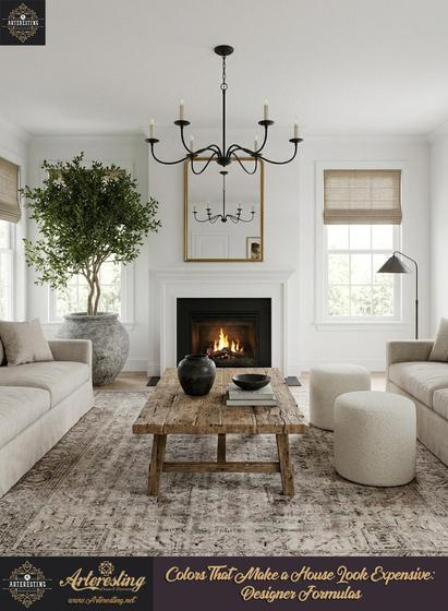
Builder-grade white flattens a room. It strips away structural dimension.
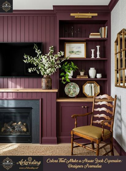
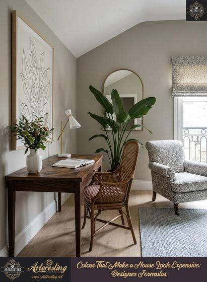
The spaces that feel like a sanctuary—those boutique hotel rooms or thoughtfully designed Brooklyn brownstones—rely on a very specific paint strategy. Designers aren’t just picking colors; they are selecting formulas with layered undertones that shift dynamically as the sun moves across the room.
We recently analyzed the exact paint formulas designers use to manipulate spatial perception.
A few critical takeaways:
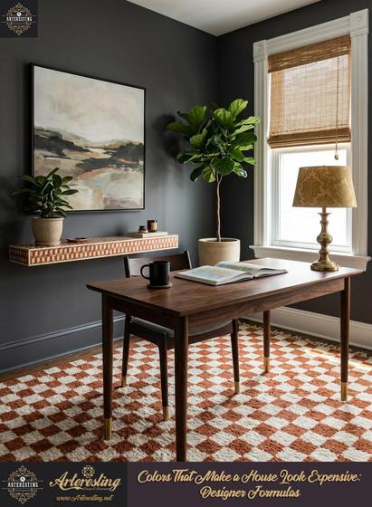
Deep olive greens (like Sherwin-Williams’ Ripe Olive) actually expand the perceived boundaries of a small footprint by swallowing harsh light and softening structural lines.
Warm, earthy neutrals require a slightly deeper shade than you think to prevent the walls from reading flat.
You can use the same off-white color for walls, trim, and ceilings, but varying the finish (matte, satin, flat) forces light to bend differently, creating instant architectural depth.
A beautiful home should feel intentional, and it starts with the canvas.
What is your approach to color when styling a new space? Do you lean toward high-contrast moody tones or layered, warm neutrals?
Read the full breakdown of these designer formulas here: https://arteresting.net/jvaq
#InteriorDesign #SpatialPsychology #DesignTrends #RealEstateStyling #OrganicModern