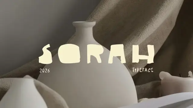
Sorah Font by Megflags: The Raw Display Typeface You Need
Perfection is overrated. The Sorah font by Megflags makes that argument loudly — and without apology. This intentionally imperfect display typeface arrives at a moment when designers are actively pushing back against the sterile, over-polished aesthetic that dominated the last decade of digital branding. Raw edges, quiet tension, and honest forms: that’s the Sorah font’s creative philosophy in three phrases. And honestly, it’s refreshing. If you’ve ever felt that most display fonts look like they were built by an algorithm rather than a human hand, this one is going to feel different. It’s tactile, slightly defiant, and entirely purposeful.
You can download the typeface for a low budget from:
Creative Market YouWorkForThemWhat Exactly Makes the Sorah Font Stand Apart From Other Display Typefaces?
Most display typefaces chase symmetry. They obsess over optical corrections, perfect bezier curves, and mathematical spacing. The Sorah font deliberately rejects that path. Instead, it commits to raw shapes and uneven edges — not as a mistake, but as a considered design stance.
Megflags describe their creation as “built on quiet tension.” That phrase deserves unpacking. Quiet tension means the letterforms feel alive without being loud. They carry a sense of handmade energy that doesn’t scream for attention. Furthermore, that restraint is exactly what makes the Sorah font work so well as a branding tool. It doesn’t compete with the content around it. Rather, it supports it — at a respectful, grounded distance.
The typeface ships in two weights: regular and bold. That pairing is intentional. Megflags note that the Sorah font “needs contrast, not competition.” So the two weights aren’t just size variations — they’re conversational partners. Use one to anchor, and the other to accent. The result is a typographic system with built-in versatility.
The Organic Typography Framework: Why Imperfection Is a Design Strategy
Let’s establish a working concept here: Organic Typography — a term I’m using to describe typefaces that deliberately preserve the evidence of human creation within their letterforms. The Sorah font is a textbook example of this framework.
Organic Typography operates on three principles: tactility, variance, and restraint. Tactility means the letterforms feel physical, as though you could run your thumb across them. Variance means no two strokes feel robotically identical. Restraint means the imperfection never tips into chaos. The Sorah font checks every one of those boxes cleanly.
This framework matters because designers increasingly need language to justify unconventional type choices to clients. Calling something “imperfect” sounds like a flaw. Calling it Organic Typography reframes it as a methodology. That’s a meaningful shift — especially in branding presentations.
Sorah Font by MegflagsYou can download the typeface for a low budget from:
Creative Market YouWorkForThemThe Sorah Font Aesthetic: Tactile, Organic, and Quietly Defiant
Spend a few minutes with the Sorah font, and you’ll notice something specific: the characters feel like they were cut, not drawn. There’s a physical quality to the strokes that recalls block printing, linocut, or even concrete lettering on brutalist architecture. That tactile quality is rare in digital type design, where smooth vectors are the default.
This is where the Sorah font earns its place in a broader conversation about Raw Aesthetic Typography — another framework worth naming. Raw Aesthetic Typography describes display fonts that use visible production marks, unresolved tension between strokes, or deliberately asymmetric forms as expressive tools rather than technical oversights.
How the Sorah Font Handles Weight and Contrast
The regular weight of the Sorah font is confident without being heavy. It holds its own at large display sizes but also works at medium scales for editorial headers. Meanwhile, the bold weight amplifies the inherent roughness of the forms — strokes thicken in ways that feel almost carved rather than digitally inflated.
Together, these two weights create what I’d call a Typographic Tension Pairing — where the visual weight difference between the two styles produces energy rather than imbalance. This is the practical expression of Megflags’ philosophy: contrast as a compositional tool, not a stylistic indulgence.
The spacing also deserves mention. The Sorah font tracks in a way that lets each letterform breathe. Consequently, words set in this typeface feel deliberate — each character occupying its space with purpose. That’s not accidental. It reflects the same design discipline that governs the overall aesthetic.
Why Branding Designers Should Add the Sorah Font to Their Type Library Right Now
Display fonts live and die by their versatility in real-world applications. A typeface that only works at 120pt on a white background isn’t a useful tool — it’s a wallpaper border. The Sorah font, by contrast, performs across a meaningful range of branding contexts.
Consider these use cases:
- Brand identity systems — particularly for independent businesses, makers, and creative studios that want to signal craft and authenticity over corporate polish.
- Packaging design — the tactile quality of the Sorah font translates beautifully to physical surfaces, from kraft paper to matte coated stock.
- Poster and event design — the raw edges hold up beautifully at large scale, and the letterforms command attention without resorting to gimmicks.
- Editorial headers — culture publications, independent magazines, and design-forward blogs will find the Sorah font a natural fit for chapter titles and feature openers.
- Logo design — the bold weight especially lends itself to wordmark logos for brands that want texture and personality baked directly into their identity.
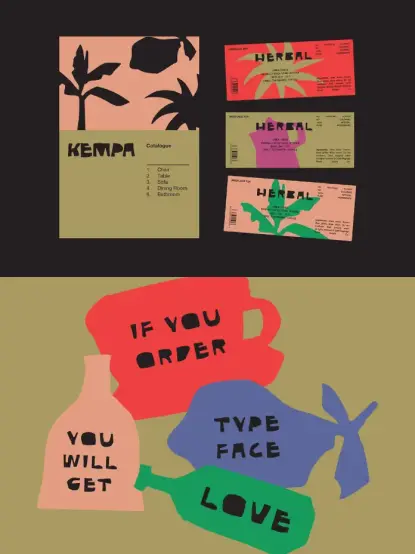
Additionally, the bonus package that Megflags include with the Sorah font is worth calling out separately. Ten hand-shaped vector illustrations — available in AI, PDF, and PNG formats — ship alongside the typeface. These aren’t generic clip art. They’re stylistically consistent with the font’s raw, organic visual language. Moreover, having companion illustration assets that match your typeface’s aesthetic is genuinely useful. It reduces the time spent hunting for visuals that don’t clash with your type choices.
Sorah Font in Context: The Broader Shift Toward Anti-Perfection in Type Design
The Sorah font didn’t emerge in a vacuum. It reflects a wider movement in type design that I’d define as Deliberate Imperfection Aesthetics — the conscious choice to preserve irregularity, roughness, and handmade energy as legitimate design values.
This movement gained traction as digital tools became so powerful that perfection became trivially easy to achieve. When any designer can produce optically corrected, mathematically precise letterforms in hours, the very precision that once signaled craft starts to signal automation instead. Consequently, designers began seeking type that felt human again.
What Deliberate Imperfection Aesthetics Means for Display Font Design
Deliberate Imperfection Aesthetics operates on a core thesis: in a saturated visual landscape, controlled roughness communicates authenticity more effectively than flawless precision. Furthermore, audiences have developed strong pattern recognition for AI-generated and algorithmically optimized design. They can feel when something is too smooth. Therefore, typefaces like the Sorah font offer a meaningful counterpoint — something that carries the evidence of human judgment in every letterform.
This isn’t nostalgia for the sake of nostalgia. It’s a strategic design choice. Brands that use the Sorah font in their visual identity are implicitly signaling something about their values: they prioritize character over convention, and honesty over optimization. That’s a powerful brand message to embed in your typography before a single word is even read.
How to Use the Sorah Font Effectively: A Practical Guide for Designers
Knowing a typeface is excellent, and knowing how to deploy it well are two different skills. Here are some grounded principles for getting the most out of the Sorah font in your projects.
Pairing the Sorah Font With Other Typefaces
The Sorah font is a display typeface first. That means it needs a calm, neutral partner for body text and supporting copy. Consider pairing it with clean geometric sans-serifs — something like Inter, Neue Haas Grotesk, or similar workhorse typefaces that won’t compete with its personality.
Avoid pairing the Sorah font with other high-personality display typefaces. Megflags are explicit about this: it needs contrast, not competition. A refined, restrained body font lets the Sorah font carry its expressive weight without the composition becoming visually chaotic.
Scale, Contrast, and Color Considerations
The Sorah font shines at display sizes — think 48pt and above for digital use, and generous headline treatments in print. At smaller sizes, the raw edges become less legible, so treat it as a headline-first typeface rather than a workhorse at all scales.
Color choices matter significantly with this typeface. High-contrast applications — black on white, white on deep color, or single-color treatments on textured backgrounds — amplify the tactile quality of the letterforms. Gradients or soft pastel backgrounds tend to soften the roughness in ways that work against the Sorah font’s character. Let it be sharp. Let it be bold. It was designed to work that way.
Putting the Bonus Vector Illustrations to Work
The ten hand-shaped vector illustrations bundled with the Sorah font deserve more than a footnote mention. These assets are stylistically consistent with the typeface’s raw, organic visual language. Use them as compositional anchors alongside the Sorah font in poster layouts, packaging design, or social media templates. They’ll reinforce the same aesthetic energy as the type itself — which is rare and genuinely valuable in a bundled typeface package.
The Sorah Font and the Future of Display Typography
Here’s a prediction worth making plainly: display typefaces that lean into Organic Typography and Deliberate Imperfection Aesthetics will grow in demand over the next three to five years. As AI-generated imagery and branding tools become more widely accessible, the visual landscape will flood with outputs that share a certain uncanny smoothness. Against that backdrop, typefaces like the Sorah font will function as authenticity signals — immediate, non-verbal indicators that a human made something and meant it.
Megflags built the Sorah font with that philosophy embedded at the level of individual letterforms. Furthermore, the decision to include companion hand-shaped vector illustrations amplifies this effect — every asset in the package points toward the same design conviction: honest forms, honest work, honest brand communication.
For designers building brand identities, editorial systems, or packaging for independent businesses, the Sorah font isn’t just a type choice. It’s a statement about what design is for.
My Honest Take on the Sorah Font
I’ve reviewed a lot of display typefaces. Most of them are technically accomplished but emotionally inert — they do the job without saying anything. The Sorah font says something. It has a point of view, and it commits to that point of view consistently across both weights.
What I find most impressive is the restraint. It would be easy to push the imperfection further — to make the letterforms messier, more distressed, more aggressively textured. Megflags chose not to. The Sorah font is raw but not reckless. It’s defiant but not illegible. That balance is genuinely hard to achieve, and they’ve achieved it.
Additionally, the practical thinking behind the package — two weights, companion vectors, multiple file formats — shows that Megflags understand how designers actually work. This isn’t a typeface designed to look impressive in a type specimen. It’s designed to be used. That matters.
If you’re building a brand that needs to feel handmade, authentic, or rooted in craft, the Sorah font deserves a serious look. It’s not for every project. But for the right project, it’s going to be exactly right.
You can download the typeface for a low budget from:
Creative Market YouWorkForThemFrequently Asked Questions About the Sorah Font
What is the Sorah font?
The Sorah font is an intentionally imperfect display typeface created by Megflags. It features raw shapes, uneven edges, and a tactile, organic aesthetic. The Sorah font comes in two weights — regular and bold — and includes ten hand-shaped vector illustrations as a bonus.
Who is the Sorah font designed for?
The Sorah font suits graphic designers, brand identity designers, packaging designers, and editorial art directors. It works especially well for independent brands, creative studios, and businesses that want to communicate craft, authenticity, and personality through their typography.
What file formats does the Sorah font come in?
The Sorah font package includes the typeface files for standard use, plus bonus vector illustrations available in AI (Adobe Illustrator), PDF, and PNG formats.
How should I pair the Sorah font with other typefaces?
Pair the Sorah font with clean, neutral sans-serif typefaces for body text. Avoid combining it with other high-personality display fonts. The Sorah font needs contrast — not competition — so a calm, restrained supporting typeface lets it carry its expressive weight without visual conflict.
Can I use the Sorah font for logo design?
Yes. The bold weight of the Sorah font works particularly well for wordmark logos. Its tactile, raw quality embeds personality and craft directly into a brand’s identity at the letterform level.
What sizes work best for the Sorah font?
The Sorah font performs best at display sizes of 48pt and above for digital applications. At smaller sizes, the raw edges reduce legibility, so treat it primarily as a headline and display typeface rather than a body copy solution.
What is the design philosophy behind the Sorah font?
Megflags built the Sorah font around the idea that honest, imperfect forms communicate authenticity more effectively than over-refined precision. The typeface deliberately preserves raw shapes, uneven edges, and quiet tension between strokes — expressing a design philosophy that values character over perfection.
Is the Sorah font suitable for packaging design?
Absolutely. The Sorah font’s tactile quality translates beautifully to physical print surfaces, from kraft paper and matte packaging stock to textured labels. Its raw aesthetic reinforces craft-oriented brand narratives at the point of sale.
What makes the Sorah font different from other rough display typefaces?
Unlike heavily distressed or aggressively textured display fonts, the Sorah font achieves a careful balance — raw but not reckless, imperfect but consistently legible. The imperfection is deliberate and restrained, making it more versatile and refined than typical rough-aesthetic typefaces on the market.
Where can I get the Sorah font?
The Sorah font is available from Megflags. Check their official storefront for current pricing, licensing terms, and the full package details, including the bonus vector illustration bundle.
Take a look at WE AND THE COLOR’s Fonts category to find more trending typefaces.
#displayFont #font #imperfection #Megflags #SorahFont #Typography