i do think it's an interesting topic, but also an incredibly depressing one. i'm just not sure if it's worth opening up this particular pandora's box of a topic - i have done my best to avoid talking about ai over the last 2 years because i've grown increasingly disturbed by it. i'm not sure i can give it anything near objective detachment or if it might devolve into a funeral dirge for the human creative spirit. 😱
considering making a video about typography in ai generated images - ostensibly "slop sans". apart from the general slight wonkiness and odd heavy weight, it often feels like some words or phrases get compressed, ala handwriting at the edge of a page when running out of space. let me know if you've spotted any other tell tale hallmarks of this pseudo-type?
Maybe you’ve heard: every font is free! Since fonts aren’t subject to copyright, you can legally ‘pirate’ them if you use a specific loophole!
...except that’s not really true. I’ve seen this claim repeated quite a lot recently, and it’s missing some pretty important nuance.
A thread 🧵
Presented without comment except this comment about my inability to write a comment.
This one's going live on YouTube tonight. With the notorious anti-piracy font incident in April, it felt like a perfect chance to explore the topic further and one of the major controversies around the birth of digital type. I hope I haven't stepped on too many toes and kept things mostly even-handed while still engaging for a general audience!
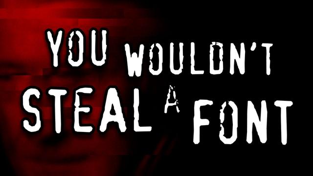
Linus Boman — Font piracy: a short intro to a long history
The infamous anti-DVD-piracy PSA turns out to have used a "pirated" font. That's deliciously ironic, but is it the most ironic case of font piracy of all time? Let's unpack a few cases from the long shared history of type design and piracy and find out.
Overall it's unremarkable and benign, and maybe that's the point. I made a satirical video a few years ago with tips for evil corporations on branding - which was basically, don't broadcast your evil, try to be pleasant and non-threatening. I guess 2025 is the year that satire not only died, but the grave of satire has been hit with a drone strike. 🤷
Also, what was this rebrand meant to achieve? It's too subtle to reposition the brand in the public, but they're too young a brand to get much utility from a new brand system. Maybe they just have so much money they can't not spend it?
The brand story they are telling visually, they want to be associated with precision, craft and specificity, all of which their own tools fall flat on, and also undermine the value of.
But did OpenAI use generative AI to design their own visual identity system? Absolutely not except in the most marginal un-exceptional ways. To generate some background images mixed in with commissioned photography in an extremely curated way. They themselves don't want to be associated visually with the AI generated slop flooding the world that they are the dumb pipes for.