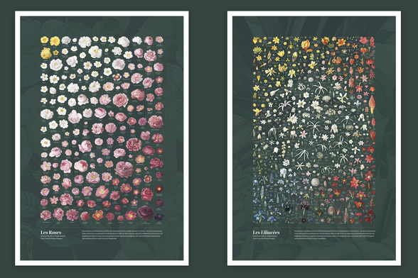
We were amazed by this week’s creative data visualizations. Check out the latest Data Vis Dispatch for ridgeline plots on climate, symbol maps on hunger, and maps on the collapse of the Assad regime.
See them all here: https://blog.datawrapper.de/data-vis-dispatch-december-10-2024/