Tiro Typeworks

@TiroTypeworks@typo.social
866 Followers
191 Following
1.2K Posts

Official account of Tiro Typeworks Ltd., a digital type foundry founded in 1994 by John Hudson and Ross Mills, specialising in custom fonts for multilingual publishing and computing.

#Typography #TypeDesign #Fonts #Unicode #WritingSystems #Linguistics #Palaeography #Calligraphy

#fedi22

Websitehttps://tiro.com/
Twitterhttps://twitter.com/TiroTypeworks
Personal@tiro_j
GitHubhttps://github.com/TiroTypeworks
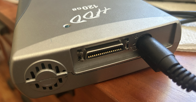
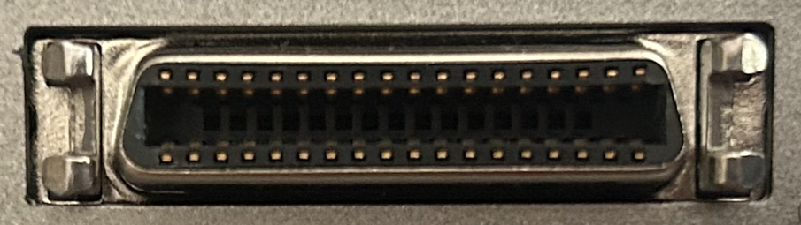
@splorp I am guessing you might be able to answer this. I have an old Iomega HDD drive and am wondering if there is some kind of to-USB adapter I can get for it?
Handpainted license plate on a Bugatti Type 75 Atalante. I wish this were permitted for modern vehicles, especially here in North America where literally everything is wrong with standardised license plates, both functionally and aesthetically.
This would be my favourite lettering medium, except someone keeps stealing my stylus and chewing on it.
I recently came across this great photograph of my father teaching at Leeds College of Art in the late 1950s. Coincidentally, I was dressed very similarly.

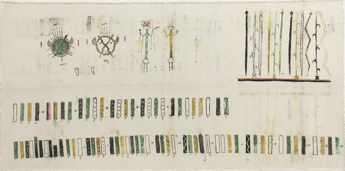
In my @atypi presentation about the Skeena Indigenous project, I spoke about how we shouldn’t presume non-literate societies lacked ways to record and transmit information.

Today, I came across this Diné (Navajo) cantillation aide-mémoire, painted on muslin cloth for easy transport. The prayer sticks illustrated along the bottom indicate the sequence of chants and their repetition.

c. 1900–1920

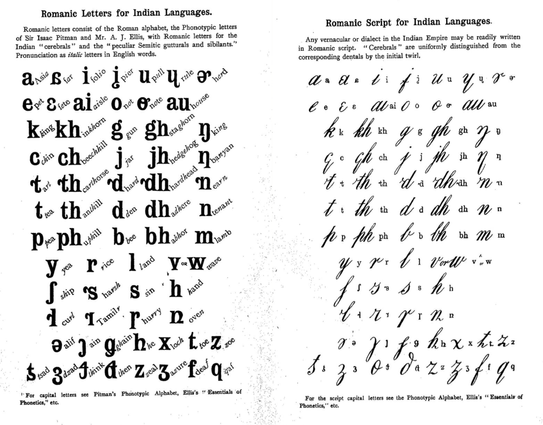
Following a link from @moyogo led me to this proposal from 1911 to replace all the writing systems of India with a new ‘Imperial Script’. The accompanying article now seems almost quaint in its assertions and rhetorical devices.

https://archive.org/details/in.ernet.dli.2015.104633/page/n271/mode/2up

Today’s bane of my existence.
Cornerstone, Saint Culumba (Church of Scotland), Pont Street, London.
There is a kind of greatness in British tabloid headline writing.
×
Today’s bane of my existence.
@TiroTypeworks
Are there any humane tools for editing math fonts, or everybody just does TTX with LaTeX preview?

@iorsh I still use the MS Math Editor. It is far from ideal, and parts are clunky, but it gives decent visual feedback for constants and some other data. Cut-in kerning is a pain in all tools because of lack of visual feedback. The best I have come up with is edit -> load font in Overleaf -> compille TeX doc -> review -> repeat.

The MATH plugin that @khaled made for Glyphs looks pretty good. The actual cut-in editing is faster than in the MS tool, but still no realtime visual feedback.

@iorsh This summation sign with subscript italic j is something else though. No matter what edits I make in the MATH table, the j just refuses to move any closer. It is doing my head in. Also, the /jitalic.ssty glyph seems to be sitting lower relative to the summation sign than other subscripts, and I am not sure what in the layout is causing that.
@TiroTypeworks I’m afraid neither LuaTeX, XeTeX, or Word apply math cut-ins for large operators. @iorsh
@TiroTypeworks as for the subscript j moving down, it might be caused by subscriptTopMax or subscriptBaselineDropMin constants (https://github.com/notofonts/math/blob/main/documentation/building-math-fonts/index.md#subscriptshiftdown-subscripttopmax-subscriptbaselinedropmin), you can confirm by observing if other glyphs with ascenders move down too @iorsh
math/documentation/building-math-fonts/index.md at main · notofonts/math

Noto Math. Contribute to notofonts/math development by creating an account on GitHub.

GitHub
@khaled Any idea what determines the spacing in these sequences (LaTeX in Overleaf)? It’s not the integral sign’s sidebearings, nor it’s italic correction, nor it’s cut-in kerning. I have edited all those, and the spacing remains unchanged. Is this a hard-distance-from-outline thing?
@TiroTypeworks Depends on how the symbol is used. If the integral is used as a big operator then it would be the advance width of the integral. If it is used as a regular symbol then it would be like any another symbol (advance width + italic correction + math cut ins). This is determined by the macro (TeX command) that the symbol.
@khaled That is what I presumed, but nothing I do to the metrics and MATH data for that glyph affects the output. There are a couple of such examples in the test docs: another is the math bold r.🤷
@TiroTypeworks I can’t really tell if it is a TeX code issue or a font issue without seeing both.
@khaled @iorsh Aha, that might be a clue (and also a possible direction to a solution, since the STIX project manager at AMS is the person responsible for the XeTeX MATH implementation).
@TiroTypeworks @khaled @iorsh 'XeTeX Math implementation' caught my eye. Is there a project url one can check (is it part of LaTeX3 project)?
@rajeesh @khaled @iorsh While working on v2.25 of STIX Two this year, we settled on XeTeX as our model implementation of OpenType MATH layout, simply because it was the software that seemed to get most right (including the stuff that the specification didn’t make clear). In particular, when it comes to cut-in kerning, I’ve got confirmations from the original math layout engineers at Microsoft that David Jones’ formula for XeTeX was correct.
@rajeesh @khaled @iorsh My understanding, though , is that XeTeX and several other flavours of TeX are no longer in active development, so however they work now is likely to remain the status quo. For most purposes, they seem to be interchangeable, but for the sake of sanity I needed to be able to target one of them in the STIX Two MATH table if their behaviour differed, and XeTeX seemed the best candidate in that I could edit table data and mostly see the results I expected.
@rajeesh @khaled @iorsh And when I say best candidate, I don’t just mean within flavours of TeX: it is also more predictable than the MS Word math handler, which occasionally and inconsistently does this sort of thing.
@TiroTypeworks @rajeesh @khaled
Does XeTeX have some API, which would accept a font and a TeX formula and shape it? I found https://github.com/NanoMichael/MicroTeX, but it seems to reimplement a lot of stuff by itself, so I wouldn't call it a reference implementation.
GitHub - NanoMichael/MicroTeX: A dynamic, cross-platform, and embeddable LaTeX rendering library

A dynamic, cross-platform, and embeddable LaTeX rendering library - NanoMichael/MicroTeX

GitHub

@iorsh @rajeesh @khaled I am hoping Khaled might be able to answer that.

I should also perhaps say that although considering XeTeX my reference implementation, I am actually doing most of my actual testing using the online LaTeX in Overleaf

https://www.overleaf.com

This is because it provides the shortest path between my MATH table editing tool and the TeX output, so means I can edit a cut-in kern, save, upload the font and recompile the test doc in a reasonably short period of time.

Overleaf, Online LaTeX Editor

An online LaTeX editor that’s easy to use. No installation, real-time collaboration, version control, hundreds of LaTeX templates, and more.

@iorsh @rajeesh @khaled So XeTeX is the reference implementation in the sense that if something seems weird in the LaTeX output and doesn’t correspond to what I am expecting from the MATH data, then I check to see what XeTeX is doing.
@iorsh TeX engines in general don’t provide APIs, they are monolithic command line tools. People come up with ways to run TeX as some long running process and feed it code snippets and get DVI in return. I’m not very familiar with this and whether it can be done with XeTeX or not. @TiroTypeworks @rajeesh
@TiroTypeworks I wrote some of the MATH support in XeTeX when I was the maintainer, but most of the MATH support (like the rest of XeTeX) was written by Jonathan Kew. Some of the recent fixes are by David M. Jones. @iorsh
@khaled @iorsh Thanks, Khaled. I should have been clearer that I was talking about the cut-in kerning formula that David M Jones worked on, and not all the MATH layout.
@TiroTypeworks No worries. The original cut-ins implementation was indeed buggy (partly my fault, and partly the spec’s). David M. Jones did a great job fixing it, including inferring the actual intent of the spec. @iorsh

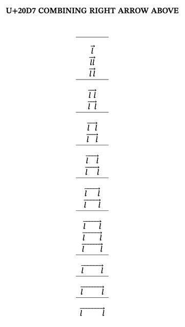
@khaled @iorsh Do you happen to know if there are similar limitations in TeX implementations regarding growing of

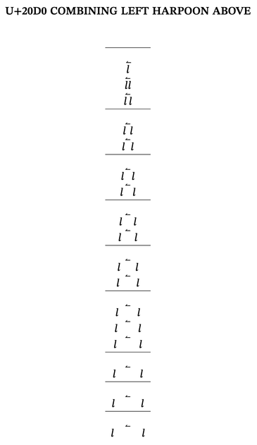
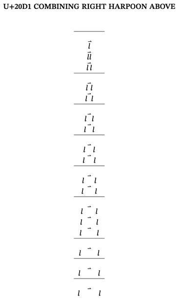
U+20D0 COMBINING LEFT HARPOON ABOVE

U+20D1 COMBINING RIGHT HARPOON ABOVE

All my above and below arrows are working (including below harpoons), but these two are not. I have checked that the MATH data is the same for all these signs.

@TiroTypeworks It might depend on how the symbol is used (it might be explicitly asking to not stretch the anchor), but the engine has no restrictions in this area AFAIK @iorsh
@khaled @iorsh Thanks. As far as I can tell, the test documents are all identically formatted, but will check again.
@iorsh FontForge has complete support for editing MATH table. The UI is clumsy at places, but no more clumsier than FontForge UI in general. I used it to build several math fonts, and I think a few open source font projects still use it. @TiroTypeworks

@khaled @iorsh

‘no more clumsier than FontForge UI in general’

is a great marketing slogan.😜

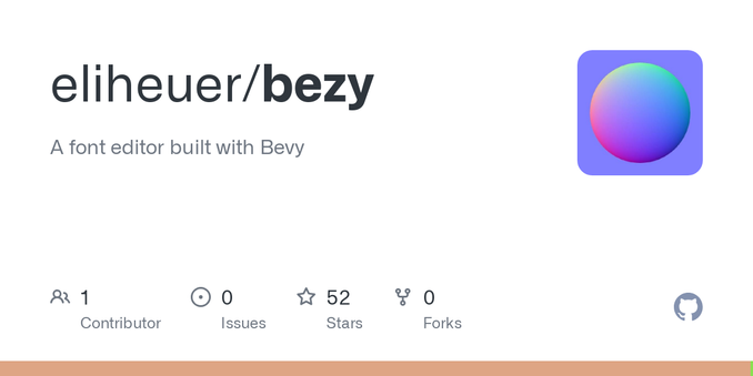
@iorsh @TiroTypeworks this is on the roadmap for my Rust-based editor Bezy. What would your ideal editing experience look like, I'll try to build it.

I'm doing a lot of ZK-proof LaTeX math stuff lately and want to make math fonts with the new editor I'm building.

https://github.com/eliheuer/bezy

GitHub - eliheuer/bezy: A font editor built with Bevy

A font editor built with Bevy. Contribute to eliheuer/bezy development by creating an account on GitHub.

GitHub

@elih @TiroTypeworks
@khaled
Sounds nice, do you have any thoughts about how the math could be previewed?

I've been contemplating about doing that in FontForge, and even found some C++ LaTeX renderer (https://github.com/NanoMichael/MicroTeX), but all this is in theory.

GitHub - NanoMichael/MicroTeX: A dynamic, cross-platform, and embeddable LaTeX rendering library

A dynamic, cross-platform, and embeddable LaTeX rendering library - NanoMichael/MicroTeX

GitHub

@iorsh MicroTeX seems to hard-code Computer Modern fonts and does not support OpenType MATH or even changing the font at all.

There are several math renderers that support OpenType MATH and can be more suitable for such project, but I have not tested most of them myself:

https://github.com/cdelker/ziamath
https://github.com/math-blocks/math-blocks
https://github.com/mgriebling/SwiftMath

@elih @TiroTypeworks

@elih @iorsh

1. Visualisation of data outcomes. The MS editor is quite good in this regard for constants, but is limited to predefined examples which are not adequate for more advanced stuff like italic correction and cut-in kerning.

2. Live feedback of cut-in kerning editing for arbitrary shaped sequences, i.e. being able to specify any base glyph and any super- or subscript and see cut-ins and how they affect relationships. This is the biggest problem with existing tool chains.

@elih @iorsh

3. Easy copying of cut-in data from one glyph to another; ideally, being able to copy cut-ins from a select quadrant to a selection of target glyphs.