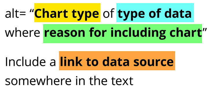
Many struggle with writing alt text for charts and other other data visualizations. Amy Cesal's "Writing Alt Text for Data Visualization" hammers home the importance of explaining the chart type, the type of data, and the reason for the chart.
https://medium.com/nightingale/writing-alt-text-for-data-visualization-2a218ef43f81
Writing Alt Text for Data Visualization
How do you write text that conveys the whole meaning of a visualization? You probably can’t. But that doesn’t mean that you shouldn’t try
Make sure web pages appear and operate in predictable ways. Things like the header, navigation, and footer should be the same on each page. Navigation links should be the same on every page and always in the same order. Things should be labeled consistently.
Templates could be designed and coded according to web accessibility standards, but this won't ensure that the final product would be accessible. Content creators still need to know about key accessibility concepts, including alt text, link text, and proper headings.
Don't write generic descriptions for alt text. "Screenshot of a news article" might technically be what the image is, but it does nothing to convey the information or context sighted users get from the image. People who can't see the image need the same information and context.
When writing alt text, ask yourself if you would picture an approximation of the image if it was described to you over the phone using the alt text you've written. Doing that exercise can be a good way to determine if you're on the right track.
Hyperlink text should make sense when read out of context. Screen reader users can navigate from link to link, and can listen to links in a list. When navigating this way, only the link is read. So "click here" or "read more" won't make sense.
Your site's users need enough time to interact with content and fill out forms. People with disabilities such as blindness, low vision, dexterity impairments, and cognitive disabilities might need more time for things such as forms. Allow users to turn off or extend time limits.
People often have difficulty reading content when there isn’t sufficient contrast, so it's important to have high color contrast. TPGi’s free color contrast checker tool allows you to determine the contrast ratio of two colors by using an eye-drop tool.
https://developer.paciellogroup.com/color-contrast-checker/
Colour Contrast Analyser (CCA) - TPGi
TPGi's ADA Color Contrast Checker helps determine the accessibility of the contrast ratio of two colors for WCAG AA and AAA.
When considering rainbow text, don't forget to consider readability and legibility. Text filled with rainbows can be difficult to read. Same with complex rainbow backgrounds. Putting each word or letter in a different color of the rainbow could force readers to work harder.
The difference between closed captions and open captions: Closed captions are on a separate track that can be turned on or off. Open captions are captions that are burned into the video, so that they are always showing. The viewer cannot turn them off.
https://www.w3.org/WAI/media/av/captions/#positioning-and-styling-captions
Captions/Subtitles
Helps you understand and create captions (also called “subtitles”) for audio and video media accessibility.