when you think about it qbasic is the ultimate fantasy console
| blog | https://j.holmes.codes |
| github | https://github.com/32bitkid |

| blog | https://j.holmes.codes |
| github | https://github.com/32bitkid |
underrated corporate design aesthetic that disappeared far too quickly in the 90s
source: Norton pcAnywhere v5.0 for DOS

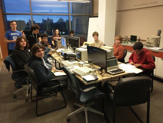
Thanksgiving week is a good week to disassemble/clean/keycap-swap on your favorite keyboard/daily-driver. Here’s mine, with fresh Macintosh inspired keycaps.

More belly rubs for Fat Mousy!
rarely talked about anymore is the tiny pixel art found in bullfrog's Syndicate (1993).
the ms-dos version received high-res 640x480 pixel art which radically enlarged the urban landscape.
since this is an isometric perspective, tiles are diamond-shaped and 16 pixels wide by 8 pixels tall.
furthermore, probably due to a combination of video memory constraints/performance at the time - the developer chose to use a paletted 16-colour mode, instead of the 256 colours that was standard by 1993.
the palette is shown in the top left. it's incredible to see how artists chris hill and paul mclaughlin managed to squeeze the perception of additional colours through very creative dithering. for example: in the top right, look at the zoomed in light tower. every single thing showing is a tile, and every single tile has been dithered using 2-3 colours, which perceptually appears (zoomed out) as an implied colour
furthermore, because this is a tile-based engine, each tile has to blend in seamlessly with many others around it. if you've ever tried to make a repeating bitmap pattern that doesn't look awful to the eye (e.g. grass, dirt or concrete) - you'll probably remember how difficult it was
the more i look at Syndicate, the more I realize that the maps are quilted together, a work of real art.