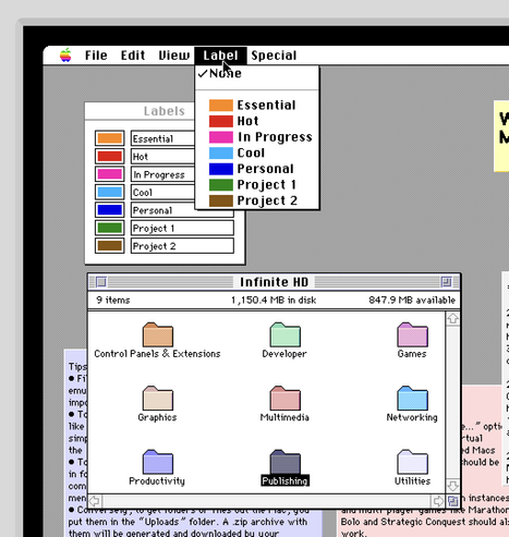
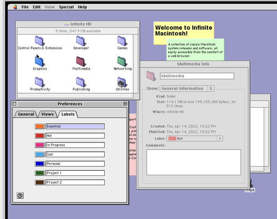
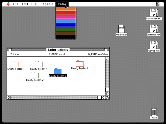
Colored folders are so 1990.

@jmfd and you can even read the text in the menu bar.

this is real innovation.

@isaiah funnily while I'm spiritually against a transparent menu bar, I'm personally for it as I was trying to build a utility to do this earlier in the year. My desktop picture is a solid color and will look great next to the notch.

@jmfd i think as long as the color behind text is pretty consistent it’s fine. but fully transparent on busy images i seems poorly considered.

and just by-the-way…

i used a #333 desktop color since about forever. like since pre OS X days.

but i actually broke down and started using the screen saver that transitions to the desktop thing.

the sea lions broke my brutalist utilitarianism. i’m a sucker for those guys. :-)

@jmfd 1990? No way that’s 1990, it looks like Mac OS 8 or something. I'm still not sold on that fancy new Platinum UI. Can we go back to System 7 please? The 1992 edition of the Macintosh Human Interface Guidelines is still my favorite by far.
@tim1724 yeah, my screenshot was from Mac OS 9, but that's because I am partial to platinum - they were actually introduced in System 6 in '88... I was just rounding to the decade 😅.
@tim1724 here is your system 7.5 beauty shot 😉
@jmfd I cannot put into words how utterly amazing the Classic Mac UI was.
@jmfd Look at those cute little guys!

@jmfd Folder colors also a 2025 thing in OneDrive/Sharepoint, at least on the Windows client.

(Went to get a screenshot on the Android app and all the folders are manilla!)

@DanielMReck ah, interesting point to know!
@jmfd I remember spending way too much time back in 1996ish playing with folder colors in Finder. It's amazing how your screenshot can hit so much nostalgia.
@jmfd It's beautiful