Pie Charts Galore! Medicaid! C...

Pie Charts Galore! Medicaid! CHIP, ACA & Medicare enrollment by Congressional District
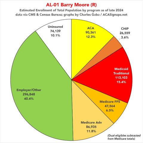
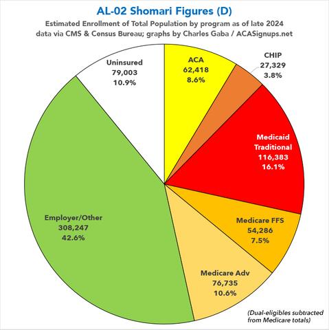
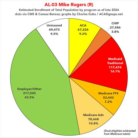
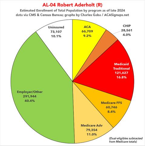
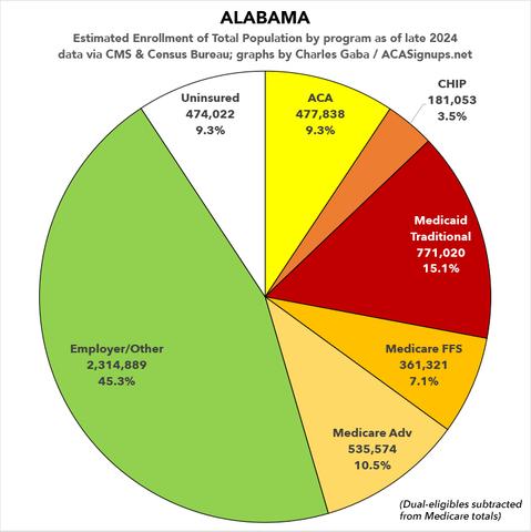
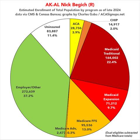
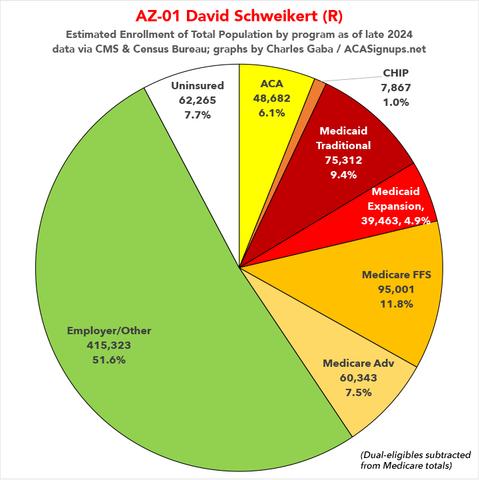
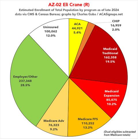
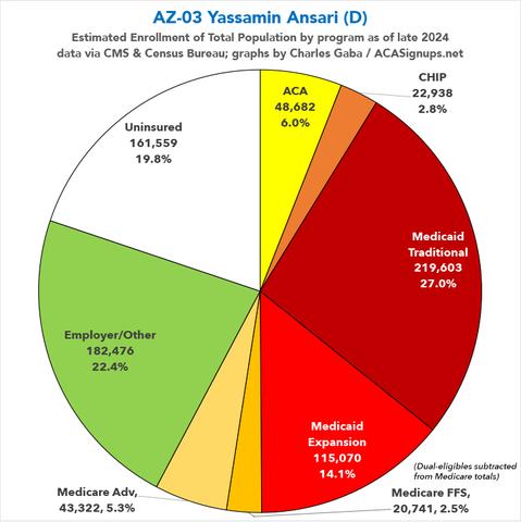
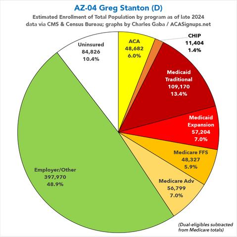
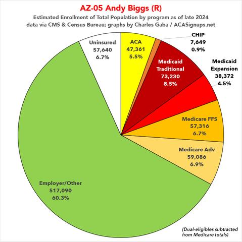
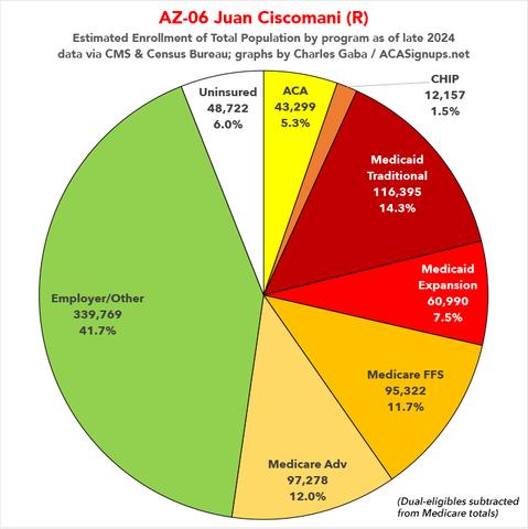
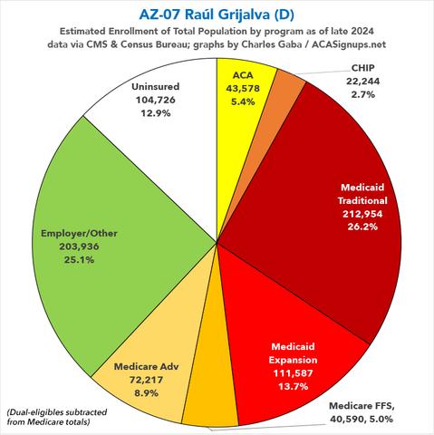
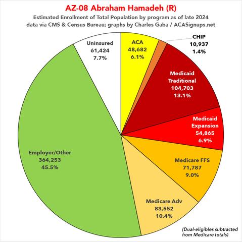
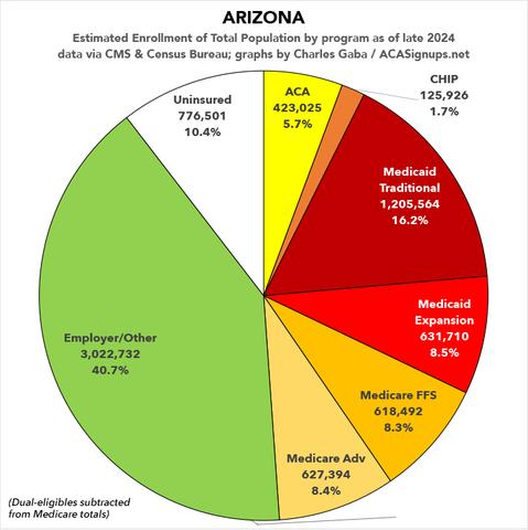
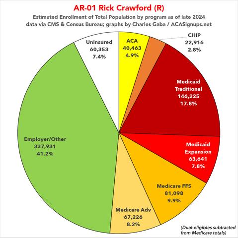
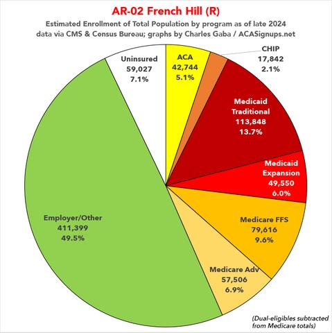
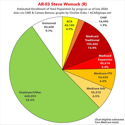
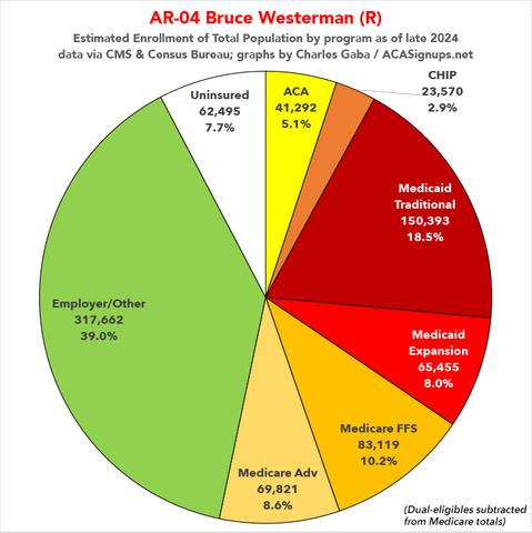
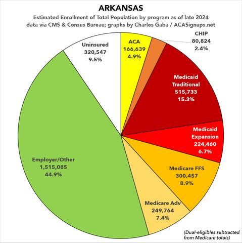
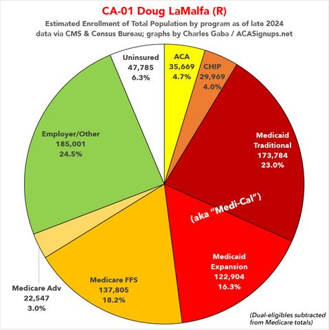
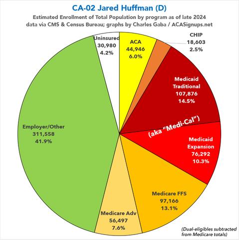
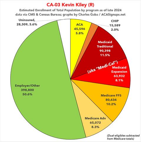
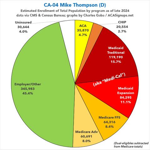
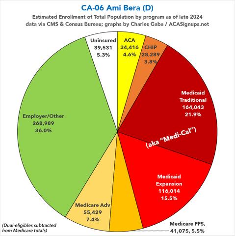
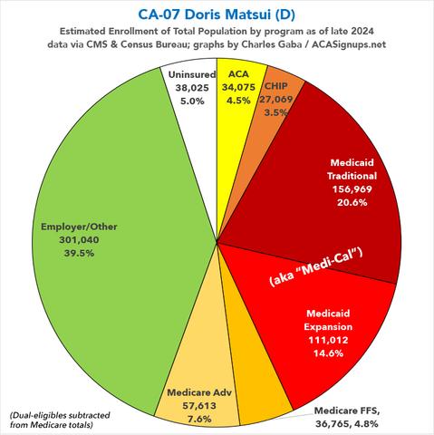
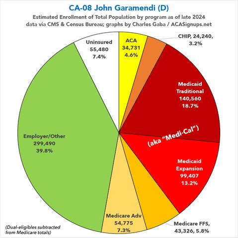
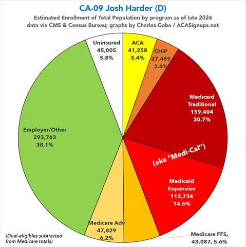
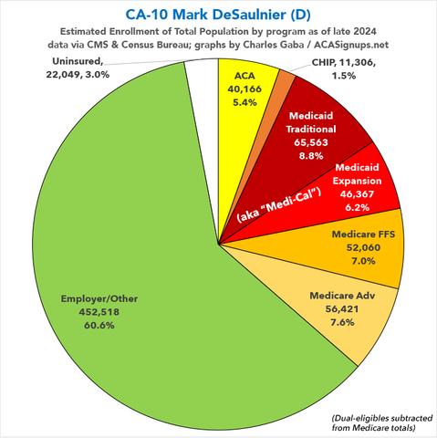
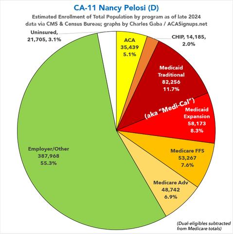
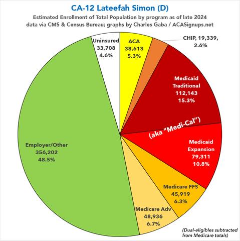
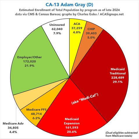
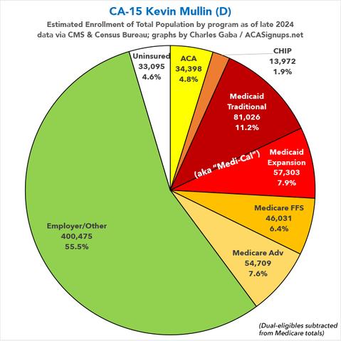
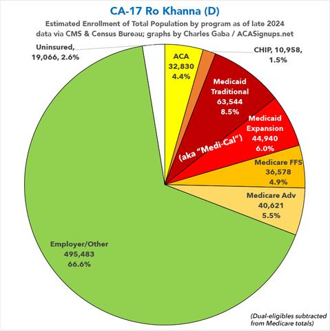
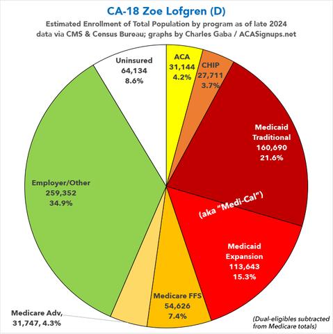
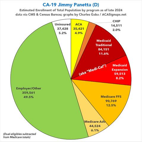
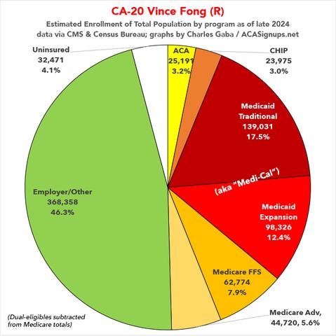
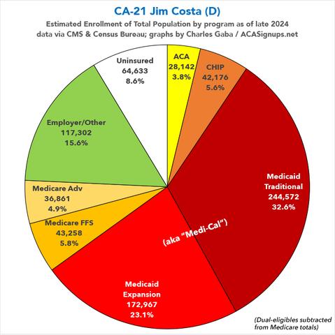
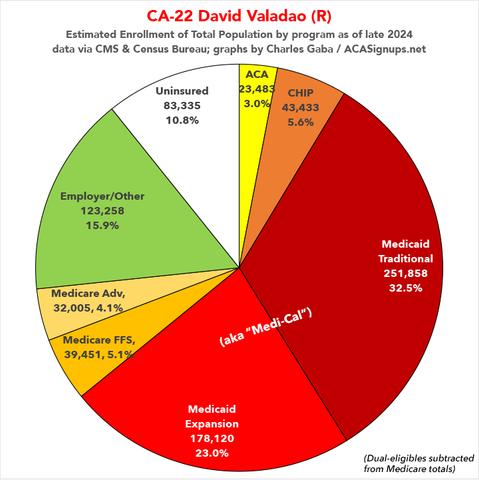
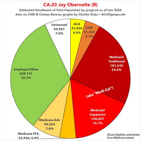
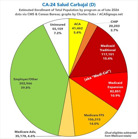
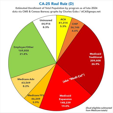
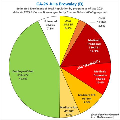
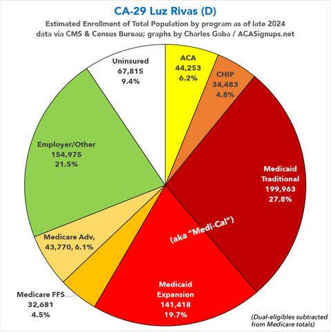
Over the past couple of months I've compiled a master spreadsheet breaking out enrollment in ACA plans (Qualified Health Plans & Basic Health Plans), Medicaid/CHIP coverage (both traditional & via ACA expansion) and Medicare (both Fee-for-Services & Advantage) at the Congressional District levels. As noted in the methodology for each, there's a small amount of fuzziness in some of the numbers for a couple of reasons, the main one being that the "as of" date varies depending on the type of coverage--Medicaid/CHIP total numbers are as of last October, while ACA Expansion Medicaid is as of last June; Medicare data is as of September 2024; and ACA exchange QHPs/BHPs are as of January 2025. With that in mind, and with the pending dire threat to several of these programs (primarily Medicaid & the ACA) from the House Republican Budget Proposal which passed yesterday, I'm going a step further and am generating pie charts which visualize just how much of every Congressional District's total population is at risk of losing healthcare coverage. USE THE DROP-DOWN MENU ABOVE TO FIND YOUR STATE & DISTRICT.