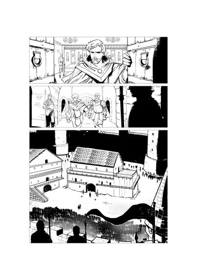
Taking on colouring yourself? The #premium reward tiers include several inked pages by 𝘑𝘢𝘬𝘢 𝘗𝘳𝘢𝘸𝘪𝘳𝘢 from the #book that you can practice on:
https://www.kickstarter.com/projects/redwulfcomics/family-and-honour-a-12th-century-historical-drama/rewards#reward-UmV3YXJkLVVtVjNZWEprTFRFeE1EazFPREUw

Or print them for your kids to colour w/ crayons

#indiecomics #comicbooks #booksky #colouring #inksky #comicsky #indiesky

Heya! Here’s a little sneak preview of the newsletter I’m going to be sending after the weekend.

Subscribe if you want to get a collection of new designs by yours truely in your inbox.

http://mailchi.mp/c4dcc3b1c437/inkdrops

#texturetattoo #protattooartist #inksky #contemporarytattooing #qttr #tattooNL #tattooutrecht

#inkvent Day 20 Potpourri ’Standard’. A moody purple with loads of shading. I have been looking for a colour like this for a while. I love it. #InkSwatch #fountainPens #inksky

Of the inks I own, it’s closest to J. Herbin’s Moon Dust, but Moon Dust is dark, warmer, wetter, and has less shading. I would definitely buy a full of this one!

#inkvent Day 18 Vibe ’Extreme Sheen’. This is a dark teal blue with lots of purple sheen. This has more sheen than any ink I have ever used before. It is almost like enamel on the page. Alphabet is with a glass dip pen & metal nib. The larger swatch is with a brush. #InkSwatch #fountainPens #inksky

Of the inks I own it is most similar in tone to my favourite blue ink, Diamine’s Eau de Nil Though Eau has no sheen and is lighter.

#inkvent Day 19 Fruit Salad ’Scented’. Neon orange with a baby aspirin scent. I could hardly get an alphabet out. #InkSwatch #fountainPens #inksky

The smell is a Proustian return to the eternal sick bed of my 70s childhood. The weird thing is my cat is super into it!? (She likes repulsive things). Where I used it with a brush, the paper disintegrated. A joke ink. The second dud in the calendar, next to ‘lemon lime’

#inkvent Day 16 Tundra ’Standard’. A beautiful warm grey with lots of shading. I would use this ink every day, for all things. Alphabet is with a glass dip pen & metal nib. The larger swatch is with a brush. #InkSwatch #fountainPens #inksky

Of the inks I own it is most similar to Pilot Iroshizuku Yama guri/Wild Chestnut except it’s cooler with no green tones. It’s also similar to J. Herbin’s Cacao du Bresil, but Tundra is cooler in tone and darker.

#inkvent Day 15 Sleigh Ride ’Intense Sheen’. A rusty brown with bright coral chroma & a green sheen. Alphabet is with a glass dip pen & metal nib. The larger swatch is with a brush. #InkSwatch #fountainPens #inksky

I don’t own anything like this but it’s similar to a sample of Vinta Havana I had.— I found that one very difficult to clean—pink residue lingered! This has similar issues. If anyone has cleaning tips for stubborn pigments, please tell me!

#inkvent Day 14 Mint Twist ’Chameleon’. This is a true green with green-copper shifting shimmer. Alphabet is with a glass dip pen & metal nib. The larger swatch is with a brush. #InkSwatch #fountainPens #inksky

Of the inks I own it is most similar in tone to Diamine classic green, but this has shimmer.

#inkvent Day 13, Lullaby ’Standard’. This is a desaturated pink-purple. Alphabet is with a glass dip pen & metal nib. The larger swatch is with a brush. Not really into this one. #InkSwatch #fountainPens #inksky

I can’t see inking a pen with this. It’s very watery, but with little shading or dimension. Maybe it would work as a highlighter ink? It’s a cute colour and would work well if you are drawing/
Ipaining with ink instead of writing.