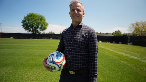
A Business Pitch Deck Layout That Actually Wins Investor Attention
Pitch decks often fail before the first word lands because investors read visual structure before they read content. A weak business pitch deck layout signals unclear thinking — and that kills deals fast. So the question isn’t just what you say. It’s how the deck says it before anyone speaks.
This Adobe InDesign template by GraphicArtist on Adobe Stock changes that dynamic entirely. Specifically, it offers a business pitch deck layout built at 1920×1080 px across 32 fully predesigned slides. Moreover, it brings a design intelligence that most founders spend weeks trying to build from scratch.
Download from Adobe Stock Please note that this template requires Adobe InDesign installed on your computer. Whether you use Mac or PC, the latest version is available on the Adobe Creative Cloud website—take a look here.
Why Does a Business Pitch Deck Layout Determine How Investors Think?
Most designers underestimate this. Investors process information visually before they process it analytically. Therefore, a structured pitch deck layout shapes the story before the presenter opens their mouth.
Cognitive scientists call this pre-narrative framing. I call it the Investor Visual Grammar (IVG) — the set of visual conventions, spatial logic, and typographic hierarchy that investor audiences have learned to expect. When a pitch deck violates IVG, the audience feels friction. Even if the content is strong, the deck loses credibility.
This template follows IVG with impressive discipline. Clean white space dominates each slide. Furthermore, a restrained blue accent palette guides attention without overpowering the data. Typography stays hierarchical and legible at screen scale. That’s not decoration — that’s argument.
Download a Business Pitch Deck Layout by GraphicArtist for Adobe InDesign.
Download from Adobe Stock What the 32-Slide Structure Actually Covers
The template organizes 32 slides into a logical progression. Roadmap, timeline, mission, vision, business goals, objectives, and approach anchor the first third. Then, market research, market size, market trends, market analysis, and target market build the analytical core. Finally, competitive analysis, competitive positioning, competitive advantages, and traction close the argument.
I call this progression the Sequential Persuasion Stack (SPS). The SPS moves from identity to market to competition to proof. Consequently, it mirrors exactly how experienced investors evaluate early-stage companies.
Each section opens with a chapter-style divider slide. Additionally, the layout alternates between data-heavy slides and narrative-led ones. That rhythm prevents cognitive overload. It also keeps the audience engaged across a longer presentation.
The Modular Slide Doctrine: Why Each Slide Stands Alone
Here’s an insight most pitch deck guides miss. The strongest business pitch deck layouts treat every slide as a standalone unit. I define this as the Modular Slide Doctrine: each slide must communicate a complete idea without depending on the previous one.
This template executes that principle precisely. For instance, the Market Research slides each carry their own data visualization, supporting label, and headline statement. Similarly, the Competitive Positioning slides work independently as standalone assets — useful for investor emails, one-pagers, or social posts.
That modularity also makes editing faster. You swap content without rebuilding the structure. Furthermore, Adobe InDesign’s paragraph styles and master pages let you update typography across all 32 slides in seconds.
Adobe InDesign: The Right Tool for This Business Pitch Deck Layout
Why InDesign over PowerPoint or Keynote? The answer is precision. InDesign gives you sub-pixel control over every element. Moreover, it handles typography with a professionalism that slide tools simply can’t match.
Specifically, InDesign’s advantages for this business pitch deck layout include:
- Master pages — apply consistent headers, footers, and grids across all 32 slides at once
- Paragraph and character styles — update every headline typeface in one click
- Linked images — swap placeholder photography without breaking layouts
- Color swatches — rebrand the entire deck by editing three global swatch values
- Interactive PDF export — add hyperlinks, bookmarks, and navigation buttons for digital distribution
- Precise grid alignment — pixel-perfect spacing that slide software rounds or approximates
Additionally, InDesign supports full bleed, custom page sizes, and export to both PDF and PNG. Therefore, you can produce a screen-ready presentation and a print-ready leave-behind from the same source file.
How the Narrative Architecture Model Works in This Template
I developed a framework called the Narrative Architecture Model (NAM) to describe how pitch decks build investor conviction. NAM identifies three structural layers: Claim, Evidence, and Context.
Every strong business pitch deck layout cycles through these three layers. Claim slides state a position boldly. Evidence slides back it with data. Context slides are placed both inside a market reality.
Interestingly, this template maps directly onto NAM. The Business Goals section states claims. The Market Research and Market Analysis sections deliver evidence. The Target Market and Market Opportunity sections provide context. Together, they build a coherent investment argument — not just a slide deck.
That matters because investors don’t fund ideas. They fund narratives backed by evidence. So the structure of your deck is the structure of your argument.
Slide Cognitive Load Index: Reading the Visual Density
Another framework worth introducing here is the Slide Cognitive Load Index (SCLI). The SCLI measures how much visual information a single slide forces a viewer to process simultaneously. High SCLI slides exhaust audiences. Low SCLI slides under-deliver.
This template hits a consistent medium-low SCLI across all 32 slides. Each slide balances one primary data point, one supporting visual, and one anchor headline. Consequently, viewers absorb the message quickly and move on without mental fatigue.
Notice the Traction slides at the end of the deck. They carry four headline metrics in a horizontal row, a trend chart below, and a supporting image. That’s deliberate density — placed at the end, when investors are already convinced and want proof points fast.
Customizing This InDesign Business Pitch Deck Layout
Customization is straightforward. Adobe InDesign organizes the template across layers, making text and image replacement logical. Additionally, all placeholder images use linked frames — drop your photography in without rearranging anything.
The color scheme uses a controlled blue-gray-white palette. You can rebrand it entirely by editing the global swatches. Furthermore, the data visualizations — pie charts, bar charts, donut charts, world maps, scatter plots — are all vector-based and editable directly within InDesign.
The 1920×1080 px canvas is ideal for screen presentations, widescreen monitors, and video backgrounds. Moreover, it exports cleanly to an interactive PDF for investor email distribution.
One practical tip: keep the master page grids locked while editing content. This preserves the spatial logic of the original business pitch deck layout. Trust the grid — it carries the design intelligence that makes the template work.
What Makes This Template Commercially Strong
Three things distinguish this template from generic pitch deck assets. First, the visual hierarchy is investor-calibrated — not just aesthetically clean, but structured the way financial audiences read information.
Second, the section architecture is complete. Many pitch deck templates stop at seven or eight slides. This one runs 32 slides across every major investment narrative category. Therefore, you don’t need to source supplementary slides from elsewhere.
Third, the data visualization system is internally consistent. All charts use the same accent blue. All iconography shares a weight and style. Consequently, the deck reads as a unified document rather than assembled parts.
My Take: A Business Pitch Deck Layout That Respects the Audience
Personally, I find most pitch deck templates either too template-obvious or too minimal to be functional. This one sits precisely where it should — structured enough to carry serious content, restrained enough not to compete with it.
The design says: We thought hard before we arrived here. And that’s exactly the message a founder needs to send. A compelling business pitch deck layout doesn’t prove your idea works. But it proves you understand that presentation is thinking made visible.
Download from Adobe Stock FAQ: Business Pitch Deck Layout for Adobe InDesign
What is a business pitch deck layout? A business pitch deck layout is the structural and visual framework of a presentation used to communicate a company’s idea, market, and growth potential to potential investors.
How many slides should a business pitch deck have? Most investor-ready pitch decks run between 10 and 20 slides for initial meetings. This template includes 32 slides to cover complete narrative depth, including market research, competitive positioning, and traction data.
Why use Adobe InDesign for a pitch deck layout? Adobe InDesign offers superior typography control, master pages, global style editing, and professional PDF export. It handles pixel-precise layouts that presentation tools like PowerPoint cannot match.
Can I customize this InDesign pitch deck template? Yes. The template is fully customizable. You can replace placeholder text and images, edit vector data visualizations, update global color swatches, and adjust typography styles across all slides.
What resolution is this pitch deck template? The template is designed at 1920×1080 px, which is ideal for widescreen screen presentations, monitor displays, and interactive PDF distribution.
Is this template suitable for startup pitch presentations? Absolutely. The 32-slide structure covers all major sections investors expect — from market size and competitive analysis to traction metrics and business roadmap.
What is the Investor Visual Grammar (IVG) framework? IVG is a conceptual framework describing the visual conventions and structural expectations that investor audiences apply when evaluating pitch decks. A strong business pitch deck layout aligns with IVG to reduce cognitive friction and increase persuasive clarity.
Where can I find this Adobe InDesign pitch deck template? The template is available on Adobe Stock, created by contributor GraphicArtist. You can access it directly through an Adobe Stock subscription or as a single purchase.
Discover other recommended graphic design and marketing templates here at WE AND THE COLOR.
#AdobeInDesign #AdobeStock #design #graphicDesign #InDesignLayout #pitch #PitchDeck