Bauhaus-Inspired Home Decor Makes the Strongest Case for Modernist Living Right Now
Bauhaus-inspired home decor has never felt more urgent. Spaces are cluttered with algorithmic trend cycles, fast furniture, and surfaces that perform personality without actually having any. Against that backdrop, the principles of the Bauhaus movement—functional beauty, geometric honesty, and material truth—land with a clarity that feels almost radical. This is not nostalgia. It is a design philosophy built for exactly the moment we are living in.
The Bauhaus school existed for only fourteen years. Walter Gropius founded it in Weimar, Germany, in 1919. Political pressure from the National Socialists forced it to close in 1933. Yet those fourteen years produced a design vocabulary so precise and so complete that it still organizes how we think about chairs, lamps, typography, and the relationship between a room and its objects. That is an extraordinary return on a short institutional life.
What makes Bauhaus-inspired home decor timely in 2026 specifically? Three forces are converging. First, there is a widespread fatigue with maximalist interiors that look spectacular in a single Instagram frame but feel exhausting to actually live inside. Second, sustainability concerns are pushing designers and homeowners toward fewer, better objects—a position Bauhaus championed a century before the word “sustainability” existed. Third, the rise of AI-generated imagery has made people crave things that are clearly, demonstrably made: tubular steel you can touch, geometric ceramic forms thrown on a wheel, and linen with a visible weave. Bauhaus delivers all of that.
This article introduces several original frameworks for understanding and applying Bauhaus modernist interior design in a contemporary home. It covers the core philosophy, the specific objects that carry it most effectively, and the room-by-room logic for making it work without turning your home into a museum exhibit.
What Does Bauhaus-Inspired Home Decor Actually Mean in a Living Space Today?
Most people misread Bauhaus as an aesthetic. It is, more precisely, a method. The aesthetic—geometric forms, primary color accents, industrial materials, and spatial economy—is the output of that method, not the method itself. Understanding that distinction matters because it determines whether you are decorating in a style or actually thinking like a Bauhaus designer.
The method starts with a single question: does this element need to exist? Every chair, every lamp, every vase must justify its presence through function. An ornament that serves no purpose gets removed. What remains after that editing process is the Bauhaus interior. The visual result is spare, structured, and—when executed with craft—genuinely beautiful.
The Five Principles of Bauhaus Modernist Interior Design
Bauhaus modernist interior design operates through five interconnected principles. Together they form what I call the Integrated Function Framework—a system where removing any single principle breaks the coherence of the others.
Form follows function. The shape of an object is determined by what that object needs to do. A Bauhaus chair contours to the human body. A Bauhaus shelf expresses its structural logic. Nothing is shaped for decorative effect alone.
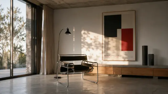
Truth to materials. Steel looks like steel. Concrete looks like concrete. Glass looks like glass. Bauhaus rejects veneers, faux finishes, and materials pretending to be something they are not. The Wassily Chair, designed by Marcel Breuer in 1925, exposes every weld and joint because the construction is part of the design.
Geometric simplicity. Circles, squares, and triangles are the primary vocabulary. Complexity comes from composition, not from elaborated forms. A room built on a clear geometric grid feels immediately legible. You know where to sit, where the light falls, and where to look.
Restricted color logic. The original Bauhaus palette anchored itself in primary colors—red, yellow, and blue—set against black, white, and gray. Contemporary application often softens this into neutral foundations with one or two deliberate color statements. The keyword is deliberate. Every color must have a reason.
Unified design vision. No element should feel accidental. The Bauhaus concept of Gesamtkunstwerk—a total work of art—means the room is a single composition. A tubular steel lamp, a geometric ceramic vase, and a primary-color textile are not three separate choices. They are one statement made in three materials.
Bauhaus Home Decor Objects That Do the Most Work
Bauhaus-inspired home decor is not primarily about buying specific vintage pieces, though those are worth knowing. It is about understanding which object categories carry the philosophy most effectively and how to select within them. Three categories stand above all others in a residential context: functional furniture, geometric vases, and wall art.
Functional Furniture: The Backbone of Minimalist Interior Design
Minimalist furniture in the Bauhaus tradition shares three qualities: visible structure, industrial materials, and proportions derived from human use rather than decorative convention. The Wassily Chair remains the clearest example. Breuer took the tubular steel technology he had observed in bicycle frames and applied it to seating. The result was a chair whose structural logic you can trace with your eyes from any angle.
For contemporary homes, you do not need original pieces or even licensed reproductions. Furthermore, you do not need to limit yourself to mid-century references. Instead, apply the selection criteria: Can you see how the piece is made? Does the shape follow the body or the room’s function? Is there any element that exists purely for decoration? If the answers are yes, yes, and no, the piece belongs in a Bauhaus home decor scheme.
Cantilevered chairs, modular shelving systems, and tables with exposed joinery all pass this test. Upholstered pieces work when the upholstery material is honest—leather, linen, or wool—and the frame structure remains visible rather than buried. Meanwhile, pieces with carved feet, decorative molding, or surfaces that simulate other materials fail the test categorically.
One framework I find useful here is what I call Material Legibility: can a person standing in the room identify every material used in a piece of furniture without touching it? If yes, the piece has material legibility. If not, it is hiding something—and Bauhaus interiors do not hide things.
Geometric Vases: The Smallest and Most Precise Test of the Philosophy
A geometric vase is, in some ways, the purest object in Bauhaus home decor. It is small enough to hold in your hand. Yet it must function—it holds flowers or stems—and its form must be derived from that function rather than from decoration. Cylinder, sphere, cone. The three base geometries that Bauhaus favors are the three geometries that also make structurally honest vessels.
Contemporary ceramic designers working in this space tend to produce pieces in matte clay bodies with slight irregularities that record the making process. That is exactly right. The Bauhaus believed craft and industrial production were not opposites but partners. A hand-thrown cylinder with a visible throwing line has more authenticity than a perfectly machine-cast sphere with no fingerprints on it.
Color matters here. A geometric vase in a Bauhaus interior should either anchor the room’s primary color statement or recede in matte white, black, or concrete gray. It should not be decorative in isolation. Moreover, it should be placed where it completes the room’s geometric composition—on a surface that creates a deliberate visual relationship with the architecture behind it.
When selecting geometric vases, I apply what I call the Functional Object Test: if the vase were empty, would it still earn its place in the room? A true Bauhaus object answers yes. Its form justifies its presence independent of what it contains.
Bauhaus Wall Art and Posters: Typography, Geometry, and Accessible Entry Points
Bauhaus wall art—particularly exhibition posters from the period and contemporary work in that tradition—offers the most accessible entry point into modernist interior design. A single framed poster by Herbert Bayer or a geometric abstraction in the manner of Paul Klee can anchor an entire room’s visual logic without requiring you to replace a single piece of furniture.
The graphic design of the Bauhaus was as radical as its architecture. Herbert Bayer developed the Universal typeface, a sans-serif system that abandoned capital letters entirely in favor of functional legibility. László Moholy-Nagy created dynamic compositions where typography and abstract geometry merged into single visual fields. These works were not decorations. They were arguments about how visual communication should operate.
For contemporary walls, Bauhaus-inspired prints work best when they follow the Compositional Anchor Rule: one strong geometric work per wall, never competing with another. The geometry in the print should echo the geometry in the room—a circular composition above a round table, a grid-based print above a modular shelving system. The connection does not need to be explicit. It should be felt rather than explained.
The Bauhaus Color Method for Modern Rooms
Color is where most people stumble with Bauhaus home decor. They read “primary colors” and immediately imagine a room that feels like a kindergarten. That reading misunderstands how Bauhaus color actually works.
The Bauhaus color system, developed through the work of Wassily Kandinsky and Josef Albers, was not about using primary colors everywhere. It was about using color with intention and understanding its spatial effects. Yellow advances. Blue recedes. Red commands attention. These properties determine where a color is placed, not whether it is placed at all.
In a contemporary Bauhaus interior, the color method I call Chromatic Restraint with Accent Logic works as follows. Establish a neutral ground: white or near-white walls, concrete or natural wood floors, gray or black metal elements. Then introduce a single primary color in a single dominant object. A single red chair in a white room is a Bauhaus statement. A red chair plus a yellow lamp plus a blue throw are noise.
Secondary accent colors can enter through textiles—a yellow cushion, a deep blue throw—but they must be subordinate to the primary accent. Additionally, the neutral ground must dominate the area. If you measure the square footage of color versus neutral surface, neutral should win by a ratio of at least three to one. That ratio is what gives the accent its power.
Room-by-Room Guide to Bauhaus-Inspired Home Decor
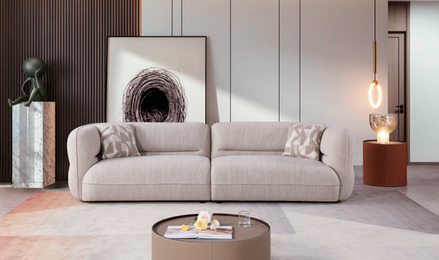
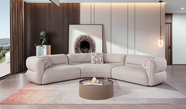
The Living Room: Geometry and Gathering
The living room is where the Bauhaus Integrated Function Framework faces its hardest test. It is a room that must accommodate social gathering, individual rest, visual focus, and circulation—four competing demands that Bauhaus design resolves through spatial zoning rather than visual division.
Start with the seating arrangement. Position sofas and chairs on a clear geometric grid, with sightlines that either terminate at a point of visual interest—a Bauhaus poster or a geometric vase on a shelf—or open toward the room’s primary light source. Avoid diagonal arrangements. Bauhaus grids are orthogonal. Furthermore, keep the floor as clear as possible. An uninterrupted floor plane reads as spatial generosity, which is one of the most important emotional qualities of a modernist interior.
Coffee tables should have visible structure and geometric form. Glass tabletops on tubular steel frames are the most literal Bauhaus choice. However, solid concrete or natural wood slabs on minimal steel legs read equally well. In contrast, tables with ornamental legs, turned wood, or carved detail break the geometric logic.
One geometric vase or sculptural ceramic object, placed at a deliberate scale—large enough to hold visual weight—anchors the room’s object composition. Everything else should be subordinate. Books, if present, should be organized by height or color rather than scattered. Cushions in one or two materials, not four or five patterns. The room should feel curated, not minimal out of poverty but minimal out of discipline.
The Kitchen and Dining Area: Bauhaus Home Decor at Its Most Functional
The kitchen is, structurally, the most Bauhaus room in any home. Every element must function. However, contemporary kitchen design often obscures this function behind decorative door fronts and hidden mechanisms. Bauhaus kitchen logic reverses that tendency.
Exposed shelving with organized objects on display enacts truth to materials—you see what the kitchen contains and how it works. Open steel shelving units, pendant lights with visible bulbs and industrial fittings, and cabinet fronts in flat matte finishes without applied molding all register as Bauhaus home decor in a kitchen context.
For the dining area, a table with a single geometric form—round, rectangular, or square, but one, not a combination—and chairs with visible structure create the right spatial statement. Lighting above the table should be direct and intentional: a single pendant or a linear array of pendants that follows the table’s geometry. The relationship between light source and table surface should be explicit, not ambient.
The Bedroom: Restraint as Comfort
Bauhaus bedroom design is often misread as cold. In practice, it creates a quality of rest that cluttered rooms cannot produce. The restraint is the comfort. When you remove every object that does not need to be there, what remains is space—and space, properly proportioned and lit, feels generous rather than empty.
The bed frame should have a visible structure. Timber frames with clean joinery, steel frames with linear geometry, or platform beds at low height with no decorative headboard elements all work. Bedside tables should be simple surfaces, ideally with one clear material—solid wood, concrete, or steel—and minimal objects on them. A lamp, a book, and nothing else are in the Bauhaus bedroom.
Textiles are where warmth enters. Linen, wool, and cotton in neutral tones with occasional color statements from the room’s accent palette bring material richness without visual clutter. Layer two or three textiles thoughtfully rather than piling on four or five. Additionally, window treatments should be functional—blocking out or filtering light effectively—without decorative flourish.
Bauhaus Lighting: The Fourth Wall of Modernist Interior Design
Lighting is often treated as an afterthought in interior design. In Bauhaus thinking, it is structural. The Bauhaus approach to lighting follows the same logic as its approach to furniture: the source should be visible, the function should be legible, and the form should be derived from the task.
Industrial pendant lights with exposed Edison bulbs, recessed lighting on a geometric grid, and articulated desk or floor lamps with visible pivot mechanisms are all Bauhaus lighting expressions. In 2026, the concept of Emotional Lighting—designing light for psychological well-being rather than mere illumination—has gained significant traction. Interestingly, this concept is most coherent when the fixtures themselves are honest about their function, which is precisely the Bauhaus position.
For a Bauhaus-inspired living room, combine one or two statement pendants with a functional floor lamp positioned to serve a specific task—reading, working, or illuminating a focal object. Avoid ambient uplighting that has no visible source. Bauhaus lighting should tell you where it comes from and what it is doing.
The Bauhaus Curve: A 2026 Update on a Classical Principle
One of the most interesting developments in 2026’s interior design landscape is what some observers are calling the Bauhaus curve—a gentle, enveloping arc that softens the movement’s historically sharp geometry without abandoning its structural logic. This is not a contradiction. The Bauhaus always valued geometry over angularity, specifically. A circle is as Bauhaus as a square.
Contemporary Bauhaus home decor can therefore include curved forms—arched doorways, rounded furniture edges, and cylindrical lighting pendants—without losing its modernist character. The test is still the Functional Object Test: does the curve serve the composition, or is it merely decorative? A gently curved sofa back that follows the spine’s natural form passes by. An arbitrary sculptural wave on a shelf edge fails.
This update matters because it opens Bauhaus-inspired home decor to a wider range of contemporary furniture and architectural details. Moreover, it corrects the common misreading of Bauhaus as exclusively rectilinear. The movement was always about geometric precision, and precision includes curves.
How to Start: A Practical Framework for Bauhaus Home Decor on Any Budget
Beginning with Bauhaus home decor does not require replacing all your furniture. Instead, apply what I call the Subtraction-First Method: before you add a single new object, remove every object in a room that fails the Functional Object Test. What remains after that edit is your Bauhaus starting point.
From there, invest in three categories in this order. First, one piece of functional furniture with visible structure and material honesty. A tubular steel chair, a modular shelving unit, or a solid wood table with clean joinery will immediately shift the room’s register. Second, one work of wall art in the Bauhaus tradition—a geometric poster, an abstract print with a restricted color palette, or a typographic work in the Bauhaus graphic tradition. Third, one or two geometric ceramic objects: a cylinder vase in matte white, a sphere in concrete gray, or a cone form in primary-color clay.
Those three investments, made thoughtfully and placed according to the Compositional Anchor Rule, will produce a room that reads as Bauhaus home decor with authority. Everything beyond that is refinement.
For budget-conscious approaches, vintage and secondhand markets are rich sources of pieces with the right structural logic. Furthermore, contemporary brands working in the minimalist furniture space often produce pieces that meet Bauhaus criteria without the premium of historical provenance. The criteria matter more than the label.
Bauhaus-Inspired Home Decor and Sustainability: A Natural Alignment
The Bauhaus philosophy and contemporary sustainability values are not merely compatible—they are structurally aligned. Bauhaus design demands fewer, better objects. It demands honesty in materials, which naturally resists the use of synthetic composites that are difficult to recycle. Moreover, it demands that every object justify its existence, which is a more radical position than any standard sustainability certification.
In 2026, when circular economy principles are increasingly shaping how consumers approach furniture and home goods, Bauhaus logic provides a clear framework: buy less, buy well, buy honest materials, and keep things long enough for the design to become familiar rather than disposable. A Wassily Chair reproduction bought today can still be in your home in forty years. A trend-cycle piece bought for a season cannot.
This alignment gives Bauhaus-inspired home decor a cultural relevance that pure aesthetic movements cannot claim. It is not just beautiful. It is a position on how objects should enter and remain in domestic life. That is why I believe Bauhaus principles will shape premium residential design for at least the next decade—not as a style to be imitated but as a standard to be met.
Forward-Looking Predictions: Where Bauhaus Home Decor Is Heading
Based on current trajectories in interior design, material science, and consumer behavior, I offer five predictions about Bauhaus-inspired home decor through 2030.
Prediction one: Material legibility will become a premium signal. As synthetic and composite materials proliferate in mass-market furniture, pieces where you can identify every material by sight will command a price and status premium. This is the Bauhaus truth to materials arriving as market logic.
Prediction two: Geometric ceramic objects will displace decorative objects in design-forward homes. The shift is already visible. Functional decorative objects—vases, bowls, sculptural forms that also hold something—are replacing purely ornamental objects in curated interiors.
Prediction three: The Bauhaus color method will replace maximalist color drenching as the dominant palette approach in design publications by 2027. Chromatic Restraint with Accent Logic offers more spatial intelligence than full-wall color saturation.
Prediction four: AI-generated interiors will make hand-crafted Bauhaus objects more desirable, not less. As digital rendering produces perfect geometric spaces effortlessly, the visible imperfection of a hand-thrown ceramic cylinder or a welded steel joint will read as evidence of authentic making.
Prediction five: The Bauhaus Integrated Function Framework will enter mainstream interior design consulting language. Designers already use its principles without naming them. Naming them creates a shared critical vocabulary that will benefit both practitioners and clients.
Frequently Asked Questions About Bauhaus-Inspired Home Decor
What is Bauhaus-inspired home decor?
Bauhaus-inspired home decor applies the principles of the Bauhaus design movement—form follows function, truth to materials, geometric simplicity, restricted color logic, and unified design vision—to residential interiors. It favors functional furniture, geometric objects, and honest materials over decorative ornament.
How do I start decorating in a Bauhaus style without replacing everything?
Start with the Subtraction-First Method: remove every object in a room that cannot justify its presence through function. Then add one structural furniture piece, one work of Bauhaus-inspired wall art, and one or two geometric ceramic objects. Build from there.
What colors are used in Bauhaus home decor?
The original Bauhaus palette used primary colors—red, yellow, and blue—against neutral grounds of black, white, and gray. Contemporary application typically establishes a dominant neutral ground with one deliberate primary or near-primary accent color. The neutral ground should dominate by area, giving the accent its visual power.
Are geometric vases a key part of Bauhaus interior design?
Yes. Geometric vases in cylinder, sphere, or cone forms are among the most direct expressions of Bauhaus principles in a home. They must function—they hold flowers or stems—and their form is derived from that function. Apply the Functional Object Test: if the vase were empty, would it still earn its place in the room?
Is Bauhaus interior design the same as minimalist interior design?
They overlap but are not identical. Bauhaus design is minimalist in the sense that it removes unnecessary ornament, but it is not minimalist for aesthetic effect alone. Every reduction in Bauhaus is a functional decision. Additionally, Bauhaus allows for more visual complexity through geometric composition and material variety than pure minimalism typically permits.
What furniture works best in a Bauhaus-inspired home?
Look for pieces with visible structure, honest materials, and proportions derived from human use. Tubular steel frames, solid wood with exposed joinery, cantilever chairs, and modular shelving systems are all strong choices. Apply the Material Legibility test: Can you identify every material in the piece by sight, without touching it?
Can Bauhaus home decor feel warm and livable?
Absolutely. Warmth in a Bauhaus interior comes from material quality and textile layering rather than from decorative accumulation. Natural wood, linen, wool, and leather all bring warmth within a Bauhaus framework. The spatial economy of the style also creates a quality of openness that many people find immediately comfortable.
What are the best Bauhaus posters and prints for a home?
Works in the tradition of Herbert Bayer, László Moholy-Nagy, and Paul Klee are the most historically grounded choices. Look for bold geometric composition, restricted color palettes, and dynamic typography. Apply the Compositional Anchor Rule: one strong geometric work per wall, positioned to echo the geometry of the furniture or architecture below it.
Is Bauhaus home decor sustainable?
Yes—structurally and philosophically. Bauhaus design demands fewer, better objects made from honest materials. This naturally aligns with circular economy principles and long-term ownership. Bauhaus pieces, whether original or contemporary, are designed to last and to remain relevant independent of trend cycles.
How is Bauhaus design different from Scandinavian minimalism?
Both traditions value functional design and material honesty, but they diverge in emphasis. Bauhaus is more geometric, more industrial, and more willing to use primary color statements. Scandinavian minimalism tends toward softer forms, warmer natural materials, and a more muted color palette. Contemporary interiors often combine elements of both—and that combination works well when the Bauhaus Integrated Function Framework governs the compositional logic.
Browse WE AND THE COLOR’s Interior Design category for more. In addition, feel free to read our articles on The Forgotten History of Bauhaus Furniture Design and The Bauhaus Blueprint: How One German School Forged Mid-Century Modern Style.
#bauhaus #design #homeDecor #homeDecoration #interiorDesign