Antiqua: Restaurierungsglas mit historischer welliger Optik bis 1x2m #Restaurierung #Denkmalpflege #HistorischesGlas #Antiqua #Sollingglas
https://romoe.ws/r/p-khqmg4g8

2/2 of the letterpress printing, which because of the guild restrictions was absolutely impossible. So subsequently there were used #Antiqua typefonts (like today). The Nazi printers weren't happy about the decision, eg Adolf Müller, printer of the party organ "Völkischer Beobachter", who loved the "aura" of the script he had always been using. This script was the Bernhard-Fraktur. It was, by the way, designed by the #Jewish graphic designer Lucian Bernhard in 1913.
#antisemitism #history
#antisemitism #history
Dabei fällt mir auf, dass es auf Mastodon leider nicht möglich ist, Fremdwörter typographisch zu kennzeichnen, was zu Verwirrungen und Missverständnissen führen kann. Schön wäre, wenn die klassische Methode unterstützt würde: Deutsche Wörter in #fraktur, Fremdwörter in #antiqua.
@drrjv The #Nazis originally had endorsed #Fraktur and other blackletter type fonts such as #Schwabacher, because these were considered #German and patriotic, but quickly outlawed them in 1941 and instead forced #Antiqua and similar #Latin style fonts onto their population after conquering other countries - allegedly because noone there could decypher these fonts. They even defamed them as "Schwabacher Judenlettern". That does however, not mean that #DorkMAGA #SpaceKaren isn't a #fascist.
#TIL:
ẜ
Long s with stroke.
The letter actually in use, according to
https://en.wikipedia.org/wiki/Fraktur#Characteristics
in #Latvia, before they finally switched to #Antiqua
ẜ
Long s with stroke.
The letter actually in use, according to
https://en.wikipedia.org/wiki/Fraktur#Characteristics
in #Latvia, before they finally switched to #Antiqua
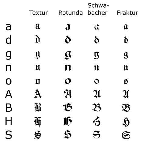
While proofreading, I observed 2 distinct ways #Typography is realised in the 1674 #EthicaComplementoria print from Copenhagen. This can happen when more than one worker is typesetting the print. Let's call them Villads & Emil. Villads has been doing this job for a while now; he routinely typesets all #Latin words w/ a beautiful cursive #Antiqua font. Emil, who's already having difficulty reading the #German text, uses #Fraktur for everything & only sets Latin proverbs in cursive. #BookHistory
#Hhig #TIL, dass es eine lateinische »#Sütterlin«-Schrift gibt, quasi eine Entsprechung der #Antiqua, wenn #Kurrent die Handschrift-#Fraktur ist.
https://de.wikipedia.org/wiki/Datei:S%C3%BCtterlin_,_lateinisches_Alphabet.jpg
https://de.wikipedia.org/wiki/Datei:S%C3%BCtterlin_,_lateinisches_Alphabet.jpg

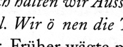
O, ich hab schon drei #Satzfehler in #Detailtypografie gefunden. Zwei davon auf einmal. 😩
•natürlich sollte da ein ff (als Ligatur) stehen. »öffnen«
•Nicht im Bild, aber der Kontext (derselbe #Blindtext in neun anderen Schriftarten als Beispiel für unterschiedliche #Kursive) macht klar: der Satz müsste in #Antiqua (Normale) stehen.
…
https://www.goodreads.com/book/show/2633651-detailtypografie
#OspalhLiest #OspalhReads